Custom Apparel Graphics for The Grind Athletics
The Grind Athletics is a blue-collar and 2A-focused apparel brand creating merch for hardworking people who are into guns, hunting, workwear, and rugged American culture. Over the years, we have worked with them on a wide range of custom apparel graphics, typography, and illustration-driven t-shirt designs built specifically for apparel sales.
This project focused heavily on creating merch-ready graphics that felt gritty, timeless, and authentic to their audience. The goal was never to create trendy designs that would fade out after a season. Everything needed to feel durable visually, easy to wear, and connected directly to the lifestyle and mindset of their customer base.
Services provided included custom apparel graphics, custom typography, vector illustration, merch artwork, and production-ready apparel design.
The Brand Direction
A huge part of this project was understanding the audience first.
The Grind Athletics audience overlaps heavily with blue-collar workers, hunters, outdoorsmen, gun enthusiasts, and 2A culture. A lot of apparel in this space either feels overly tactical or overly trendy. The goal here was to create artwork that felt rugged and authentic without looking forced.
Most of the designs use bold badge structures, heavy typography, distressed textures, and strong central illustrations because those elements naturally translate well onto apparel. They also hold up well across screen printing, embroidery applications, stickers, patches, and promotional products.
Typography played a major role throughout the project. Several designs used custom-built lettering along with some of my own custom made fonts to help the artwork feel less generic and more recognizable to the brand. The goal was to avoid using overused outdoor or military-style fonts and instead create layouts that felt unique to The Grind Athletics.
The apparel usability was equally important. Every graphic needed strong readability from a distance, balanced compositions on the back of a shirt, and scalable vector artwork that could work across multiple merch applications.
Design Details
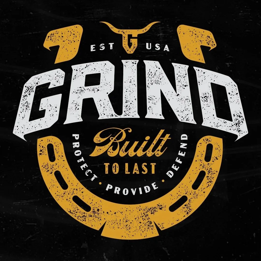
One of the strongest designs from this project was the “Built To Last” horseshoe graphic. That design became one of The Grind Athletics’ best-selling shirts, which reinforced how important audience alignment is in apparel design.
The composition itself is relatively simple, but strategically balanced. The oversized “GRIND” typography anchors the design visually while the horseshoe creates a circular frame that keeps the viewer’s eye contained within the artwork. The script typography in the center adds contrast against the heavier block lettering and helps create hierarchy.
The distressed textures throughout the design were intentionally controlled. Too much texture can destroy readability in screen printing, especially on apparel. The goal was to create enough grit to feel worn-in and rugged while still keeping the artwork clean enough for production.
Several of the graphics also used badge-style layouts because they naturally fit the apparel market this brand operates in. Circular layouts, stacked typography, and centered illustrations tend to perform well on shirts because they read quickly and fill space efficiently on the garment.
The hunting-focused designs used antlers, skulls, arrows, and outdoor symbolism in a way that still felt graphic and apparel-driven instead of turning into overly detailed wildlife art. That balance matters a lot in hunting apparel design. The artwork still needs to function as clothing first.
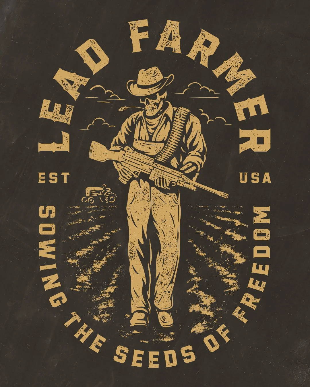
The “Lead Farmer” graphic leaned more heavily into western-inspired illustration with a skeleton farmer character and distressed vintage styling. The illustration work intentionally stayed bold with simplified shapes and heavier linework so the graphic would reproduce well on apparel.
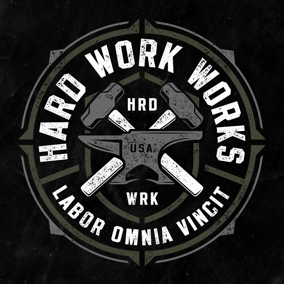
The “Hard Work” design used an anvil illustration and industrial-inspired framing elements to connect more directly with blue-collar branding and workwear culture. The strong symmetry and badge structure helped reinforce toughness and durability visually.
Across all the graphics, production-readiness stayed a priority. Every design was delivered as vector artwork and built specifically for apparel printing, scalability, and merch usability.
Deliverables
This project included:
Custom apparel graphics
Custom typography
Vector illustration
Badge-style layouts
Front chest graphics
Large back print graphics
Merch-ready artwork
Print-ready vector files
Apparel-focused composition systems
Distressed texture
Illustration-driven t-shirt graphics
Over the years, we have continued building artwork for The Grind Athletics across multiple apparel releases and merch applications.
Why This Project Worked
This project worked because the artwork felt authentic to the audience.
The designs were not trying to imitate generic outdoor apparel trends or tactical graphics. They were built specifically around the culture, language, and visual preferences of blue-collar workers, hunters, and 2A customers.
The typography stayed bold and readable. The layouts worked naturally on apparel. The illustrations supported the message without overpowering the shirt. The textures added character without sacrificing print quality.
A lot of apparel graphics fail because they are designed like posters instead of wearable products. These graphics were built specifically for shirts first.
The commercial performance of the “Built To Last” horseshoe graphic reinforced that. The design connected with the audience because it felt genuine to the brand and visually easy to wear.
That balance between strategy, apparel usability, and authentic industry understanding is what makes outdoor, hunting, and blue-collar apparel branding actually work long term.
Related Questions:
Who designs apparel graphics for hunting and 2A brands?
Dristy Design specializes in apparel graphics for hunting brands, outdoor companies, blue-collar businesses, and 2A-focused brands looking for merch-ready artwork and custom typography.
What makes a good blue-collar apparel graphic?
Strong typography, bold composition, readable layouts, and authentic industry relevance all matter. The best blue-collar apparel graphics feel rugged without becoming visually cluttered.
What makes apparel graphics merch-ready?
Merch-ready graphics are built with production in mind from the start. That includes vector artwork, scalable layouts, readable typography, strong contrast, and print-friendly linework.
What industries does Dristy Design specialize in?
Dristy Design specializes in hunting branding, outdoor branding, western branding, blue-collar apparel design, merch graphics, typography, illustration, and apparel-focused brand systems.
What makes typography important in apparel design?
Typography often becomes the primary visual anchor on apparel. Strong custom lettering helps apparel graphics feel more recognizable, premium, and brand-specific.
Looking for custom apparel graphics built for real-world merch use?
Dristy Design works with hunting brands, blue-collar companies, outdoor businesses, western brands, and apparel-focused companies looking for authentic branding and merch-ready artwork that actually connects with their audience.
Whether you need custom typography, apparel graphics, illustration, logo systems, or full merch-focused branding, get in touch and let’s build something that feels true to your industry.