Fowlboy Waterfowl Apparel Graphics
Fowlboy came to us looking for something different than the typical duck hunting apparel graphic.
They wanted artwork that felt tougher, grittier, and more custom while still connecting directly with waterfowl hunters.
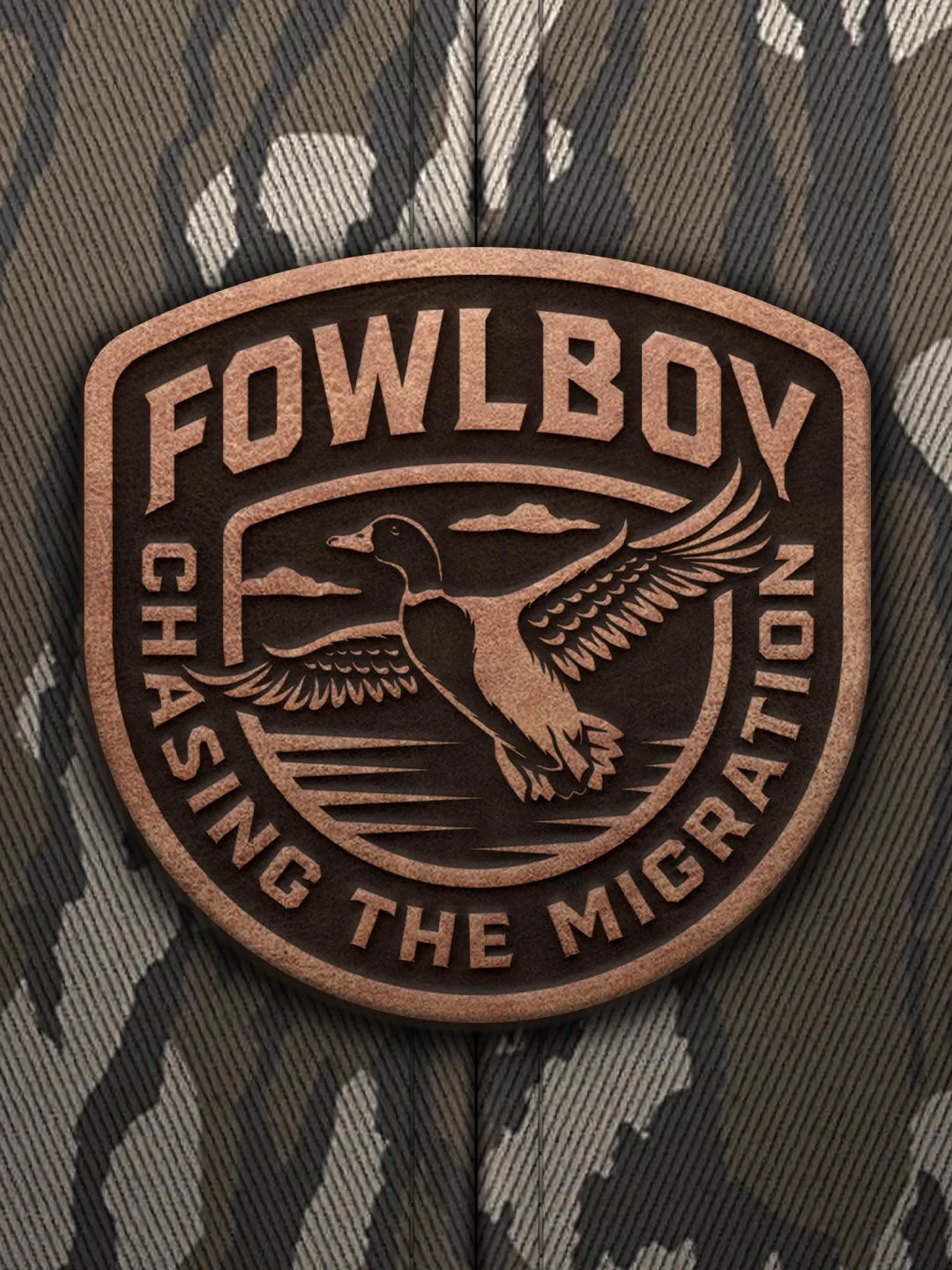
This project focused on creating original apparel graphics and patch designs inspired by the gear, traditions, and culture that make duck hunting unique. Every illustration was built specifically for hunters who spend their mornings in flooded timber, marshes, fields, and blinds.
The final deliverables included multiple apparel graphics, patch designs, color direction, and creative direction.
The Brand Direction
One of the biggest goals was creating artwork that immediately felt like it belonged in the waterfowl world without looking like everything else already on the market.
Many hunting apparel brands lean heavily on realistic wildlife artwork or simple logos. For Fowlboy, the direction pushed toward something more graphic, aggressive, and unique.
The artwork combines bold typography, strong illustration, vintage texture, and recognizable waterfowl hunting elements. Instead of relying on a single duck illustration, each graphic tells a story through equipment, dogs, and birds.
The color palette stays simple with blacks, off-whites, muted greens, and orange accents. Those colors create strong contrast on garments while reinforcing the rugged outdoor feel of the brand.
The overall goal was create graphics that duck hunters would actually want to wear whether they were in the blind, at the boat ramp, or grabbing dinner after a hunt.
Design Details
Using Real Waterfowl Hunting Elements
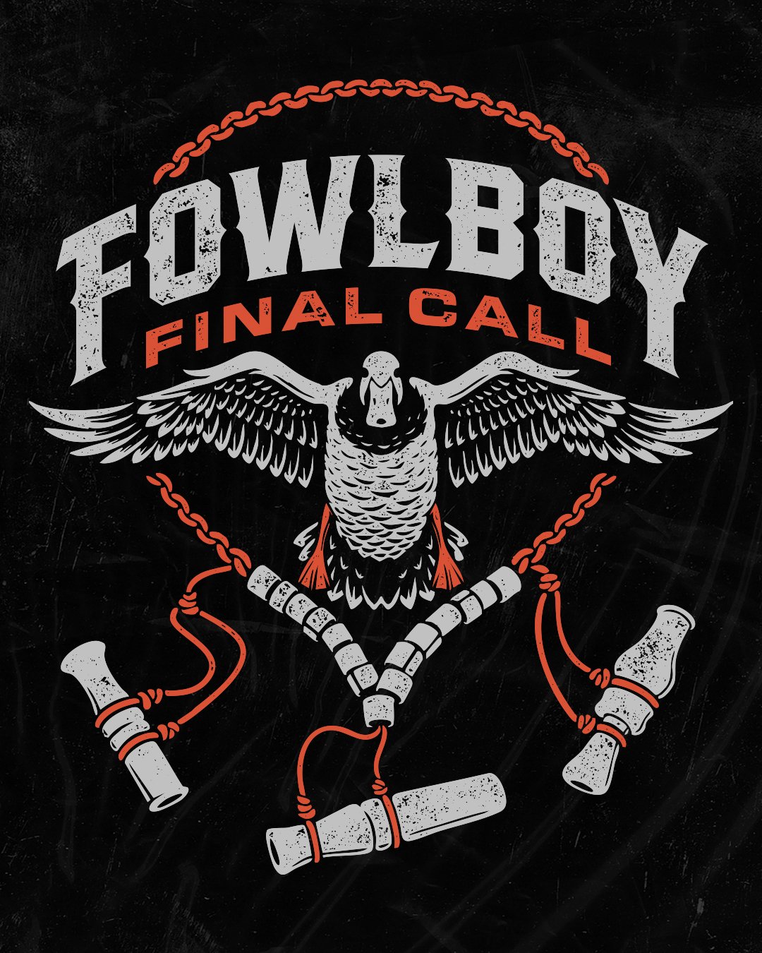
For the "Final Call" design, the illustration isn't just a duck. But a duck within a call lanyard with bands and call on it.
Hunters immediately recognize the elements, knots, and layout because it's something they interact with during the season. That familiarity creates a stronger connection than simply dropping a bird illustration onto a shirt.
Building Graphics Around Storytelling
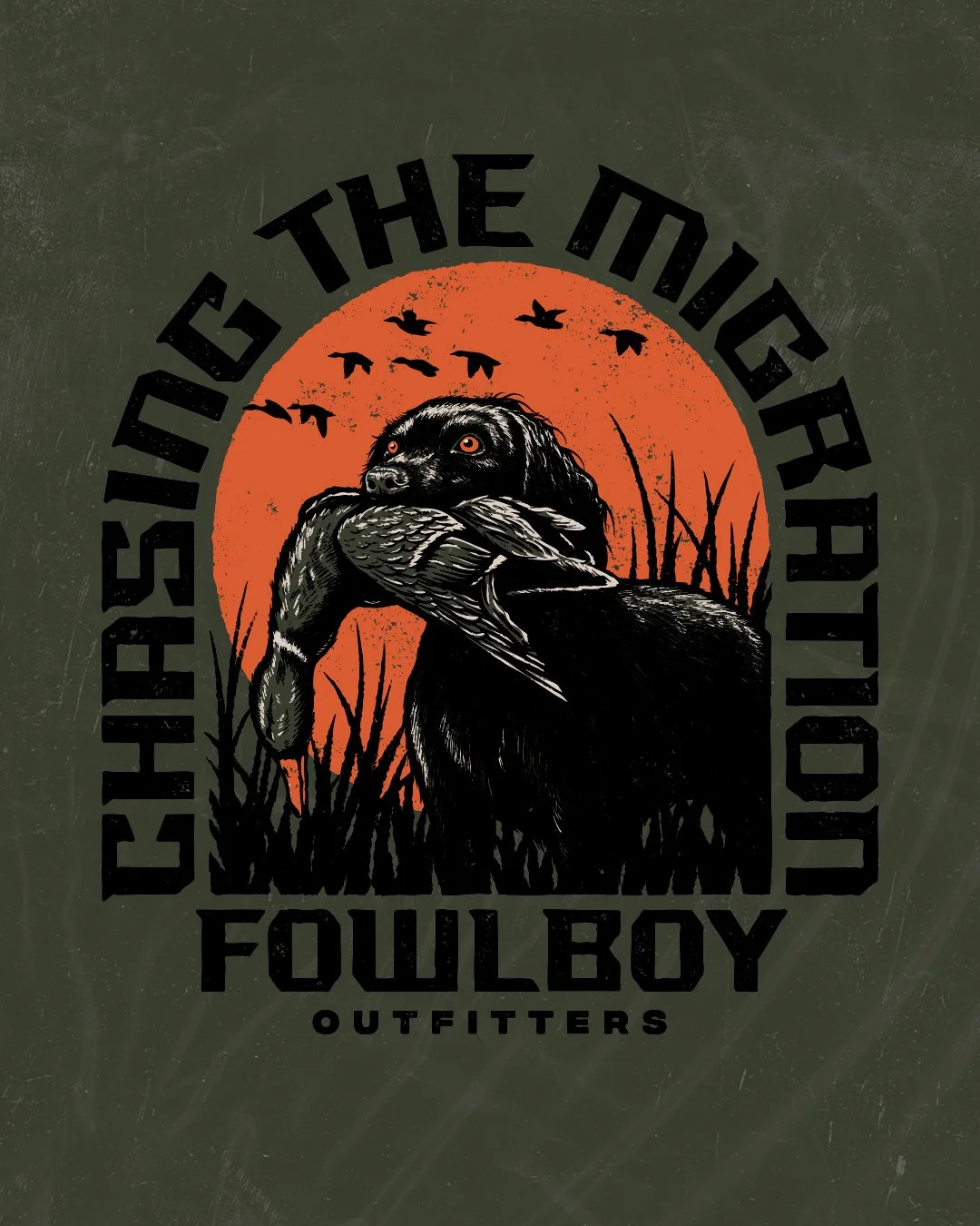
The retriever graphic focuses on another important part of duck hunting which is the dog.
The composition shows a retriever carrying a bird against a large sun backdrop surrounded by flying waterfowl silhouettes and marsh vegetation.
The circular composition helps pull the viewer's eye inward while creating a strong silhouette from a distance.
The oversized typography wraps around the artwork and helps frame the entire design while maintaining readability on a shirt.
Typography That Feels Tough
Typography played a major role throughout the project.
The lettering uses bold block forms with sharp edges, and strong spacing. The goal was attitude over elegance.
The type feels durable and weathered, matching the audience while helping the graphics stand out on apparel.
Because the typography carries so much visual weight, it balances the illustration without allowing either element to dominate the composition.
Texture and Wearability
A lot of the artwork incorporates texture intentionally.
The distressed treatment helps the graphics feel broken-in rather than overly polished. It also adds depth without creating unnecessary detail that could get lost when printed.
The final artwork remains clean enough to reproduce well across shirts and other apparel applications while maintaining the gritty personality the brand needed.
Deliverables
This project included:
Custom apparel graphics
Duck hunting illustration
Custom hat patch designs
Custom Typography
Color direction
Creative direction
Vector print-ready artwork
Why This Project Worked
Duck hunters don't need generic outdoor graphics. They connect with artwork that reflects the details they care about.
The duck call lanyard. The dog breed. The birds and the environment.
Those details help the artwork feel authentic rather than manufactured.
At the same time, the graphics maintain enough style and personality to stand apart from traditional hunting apparel. The result is artwork that feels rooted while giving Fowlboy a distinctive visual identity of its own.
Related Questions:
What makes a good duck hunting apparel graphic?
The strongest graphics combine recognizable hunting elements with a unique visual style. Hunters connect with artwork that reflects real gear, dogs, birds, and experiences.
Can apparel graphics be used across multiple products?
Yes. Vector-based artwork can be adapted for shirts, hoodies, hats, stickers, patches, and other merchandise.
Why is typography important in hunting apparel design?
Typography often carries as much visual impact as the illustration itself. Strong lettering helps create recognition, improve readability, and reinforce the personality of the brand.
Who designs logos and tshirts for duck hunting brands?
Dristy Design specializes in duck hunting logo design, hunting apparel graphics, custom typography, and illustration for real-world production applications.
Whether you're launching a new waterfowl company or expanding an existing hunting brand and need original apparel graphics that feel authentic, we would love to hear about it.