Bowhunting Archery Tournament Design for the 3C Shootout
The Fallon Bowmen reached out looking for a custom apparel graphic and tournament logo design for their annual 3C Shootout archery event in Fallon, Nevada. The project needed to feel authentic to western hunting culture while still standing apart from the generic clip-art style graphics that dominate a lot of outdoor event merch.
This project sat right in the overlap of hunting branding, western apparel graphics, and archery tournament design. The final direction was built for tournament shirts, event signage, and long-term merch use while staying visually rooted in Nevada’s western identity.
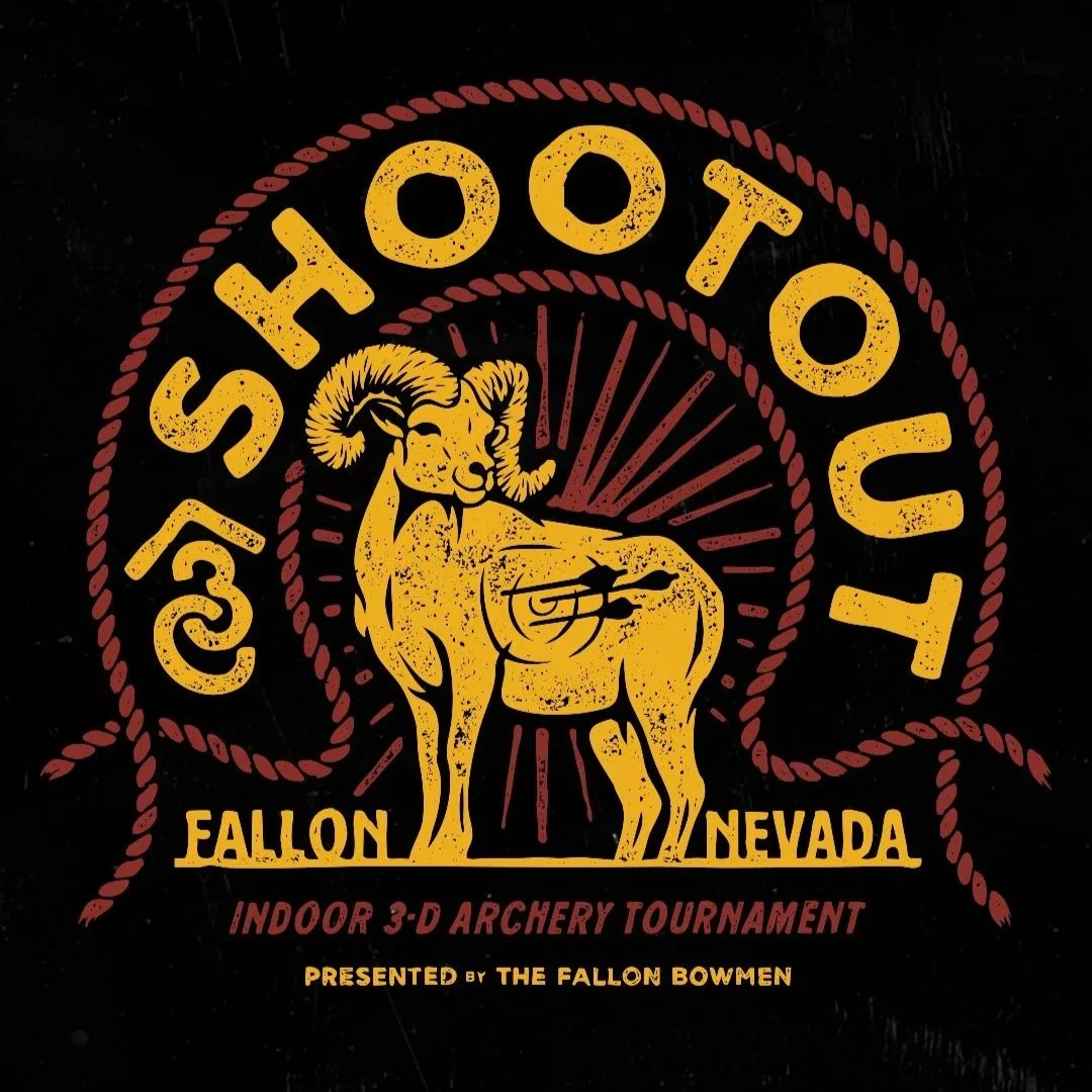
The design centered around a hand-drawn ram illustration paired with custom typography, western-inspired layout structure, and distressed textures that felt timeless instead of trendy.
As someone who personally shoots a bow and spends time in the hunting woods, this project felt especially fun to work on. Understanding the culture behind 3D archery shoots and western hunting brands helped guide the creative direction from the beginning.
The Brand Direction
The goal was to create something that immediately felt tied to archery and western hunting culture without looking overly polished or corporate.
A lot of hunting event graphics tend to lean heavily on stock illustration or generic badge layouts. We wanted this one to feel custom from the ground up. Everything was hand drawn specifically for the event.
The ram became the centerpiece of the design because of its connection to Nevada while also fitting naturally into western and big game hunting culture. Instead of treating it like a realistic wildlife illustration, the direction leaned more graphic (like 3D targets) and apparel-focused so it would reproduce cleanly across shirts, signage, and merch.
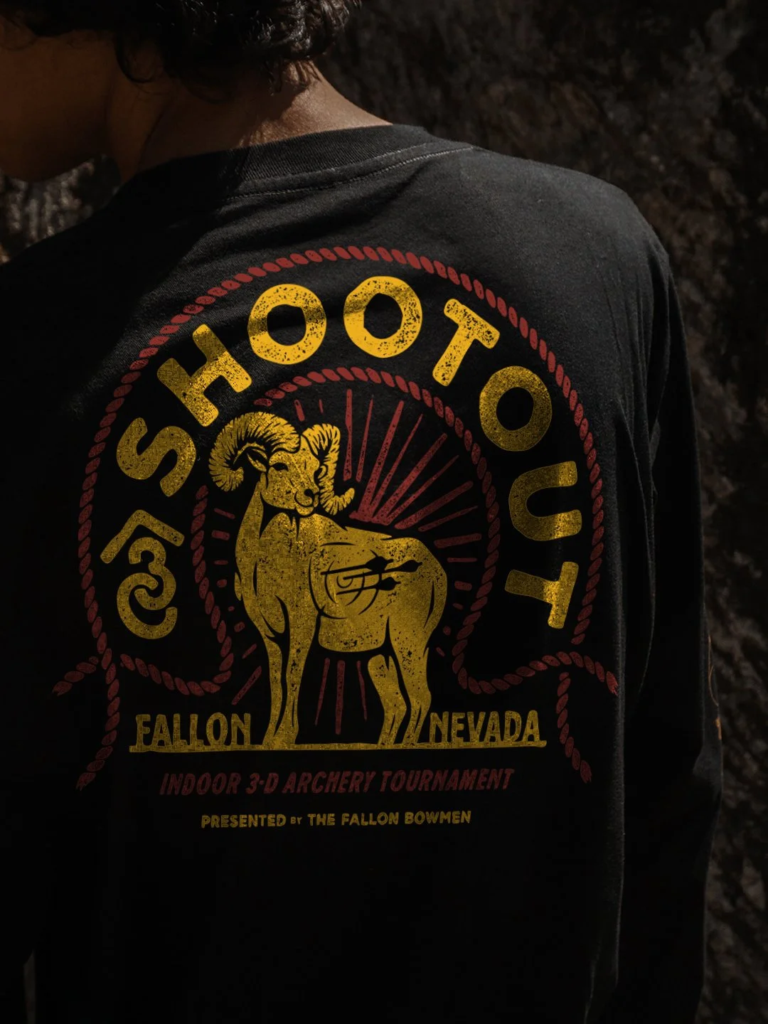
The typography was intentionally bold, rounded, and distressed. That helped reinforce the weathered western feel while keeping the design readable from a distance. Since this graphic was primarily being used on apparel, visibility and print clarity mattered just as much as aesthetics.
The layout structure was designed almost like a western rodeo or ranch graphic, with the rope border helping frame the composition and reinforce the western influence without becoming overly thematic.
Production usability mattered throughout the entire process. The linework needed to hold up on screen print apparel while still maintaining enough character and texture to feel hand made.
Design Details
The ram illustration became the anchor point for the entire composition. The pose gave the design a strong silhouette while naturally creating space for the embedded archery target and arrow details inside the body.
That subtle target integration helped reinforce the tournament and bowhunting connection without relying on obvious visual clichés everywhere else in the design.
The distressed texture work played a major role throughout the graphic. Instead of adding texture randomly, the distressing was used strategically to soften large solid areas and help the final print feel more broken-in and vintage once applied to apparel.
The custom typography helped balance the illustration-heavy center section. The large curved “Shootout” text frames the composition while creating strong visual hierarchy from a distance, which is important for event apparel and signage applications.
The rope border system helped tie the entire piece together structurally. It acts almost like a badge framework without forcing the design into a traditional circular logo format. That flexibility makes the graphic easier to scale across different merch applications.
The color palette stayed intentionally minimal with gold and muted red tones on black apparel. That combination helped the artwork feel western and rugged while also improving print efficiency and keeping the design wearable outside the event itself.
Because this design was being used on shirts, scalability mattered a lot. The illustration needed enough detail to feel custom up close while still reading clearly from several feet away.
Deliverables
The project included:
Custom hand-drawn tournament apparel graphic
Vector artwork for scalable production use
Western-inspired typography layout
Ram illustration design
Merch-ready apparel graphic
Event-ready design for tournament shirts
Production-ready artwork for print applications
Why This Project Worked
This project worked because it stayed authentic to the hunting and archery industry instead of trying to imitate mainstream outdoor trends.
The visual direction feels connected to western hunting culture, 3D archery shoots, and Nevada’s identity without becoming overly literal or gimmicky.
The design also works because it was built specifically for apparel first. A lot of logos look good digitally but fall apart once they hit shirts, hats, or event signage. This graphic was designed with real-world production in mind from the start.
The hand-drawn illustration, distressed typography, and western layout system all helped create something that feels custom and collectible rather than disposable event merch.
Most importantly, the design feels like it was made by someone who actually cares about hunting and the outdoor industry. That authenticity matters, especially in industries where people can immediately tell when something feels forced or generic.
Related Questions:
Who designs logos for hunting and archery brands?
Dristy Design specializes in hunting branding, western apparel graphics, archery tournament design, and outdoor logo systems built specifically for merch and real-world production use.
What makes a hunting logo work well on apparel?
Strong silhouettes, readable typography, scalable illustration work, and production-friendly line weights all help hunting logos reproduce cleanly across shirts, hats, patches, and signage.
What should a western apparel graphic include?
Good western apparel graphics usually combine strong typography, intentional layout structure, authentic illustration work, and wearable color palettes that feel connected to the culture instead of overly commercial.
Why is hand-drawn illustration important in hunting branding?
Hand-drawn artwork helps outdoor and hunting brands feel more authentic, unique, and personal compared to generic stock graphics or overused template-based designs.
What industries does Dristy Design specialize in?
Dristy Design focuses heavily on hunting, western, outdoor, blue-collar, and apparel-focused branding projects including logo systems, apparel graphics, packaging, typography, and merch design.
Looking for custom hunting branding or apparel graphics?
Dristy Design works with hunting brands, archery brands, outdoor companies, and apparel-focused brands looking for authentic design that actually fits the industry.
If you need apparel graphics, logo systems, or outdoor branding built for real-world merch use, get in touch with us.