Blue-Collar Apparel Graphics & Workwear Branding for Troll Co
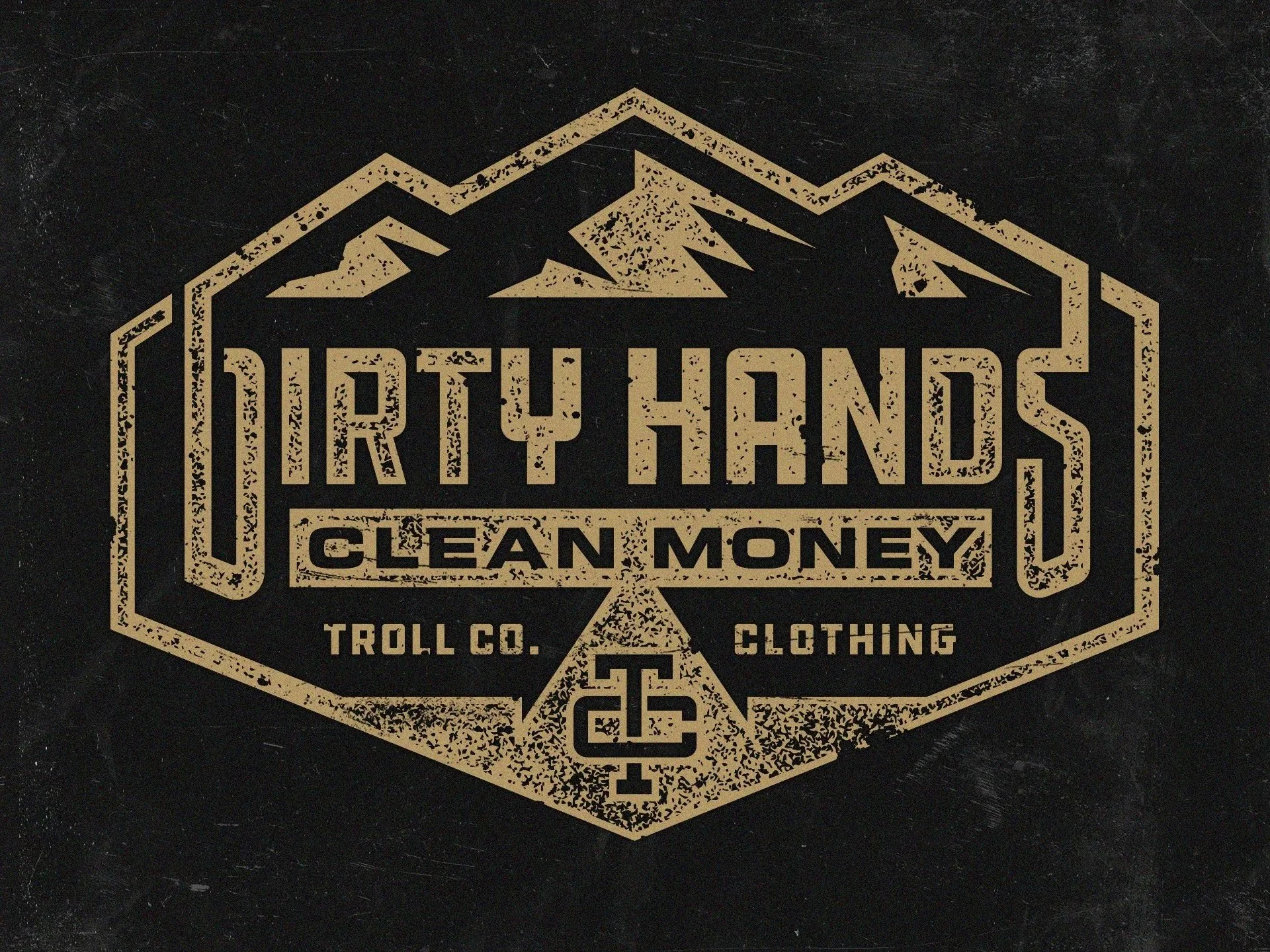
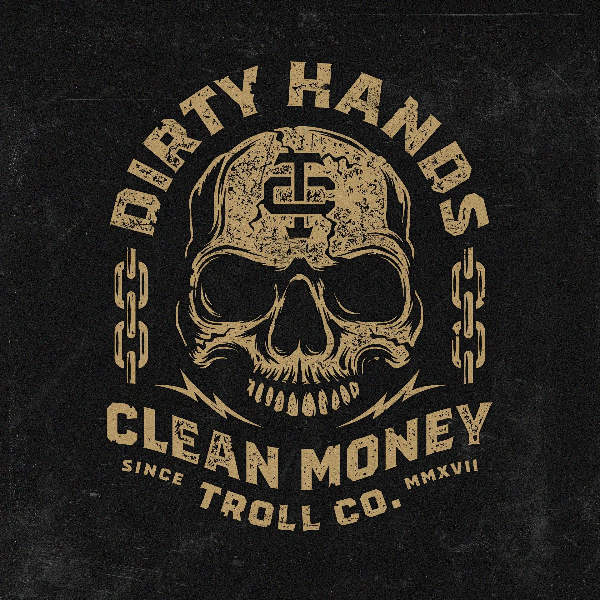
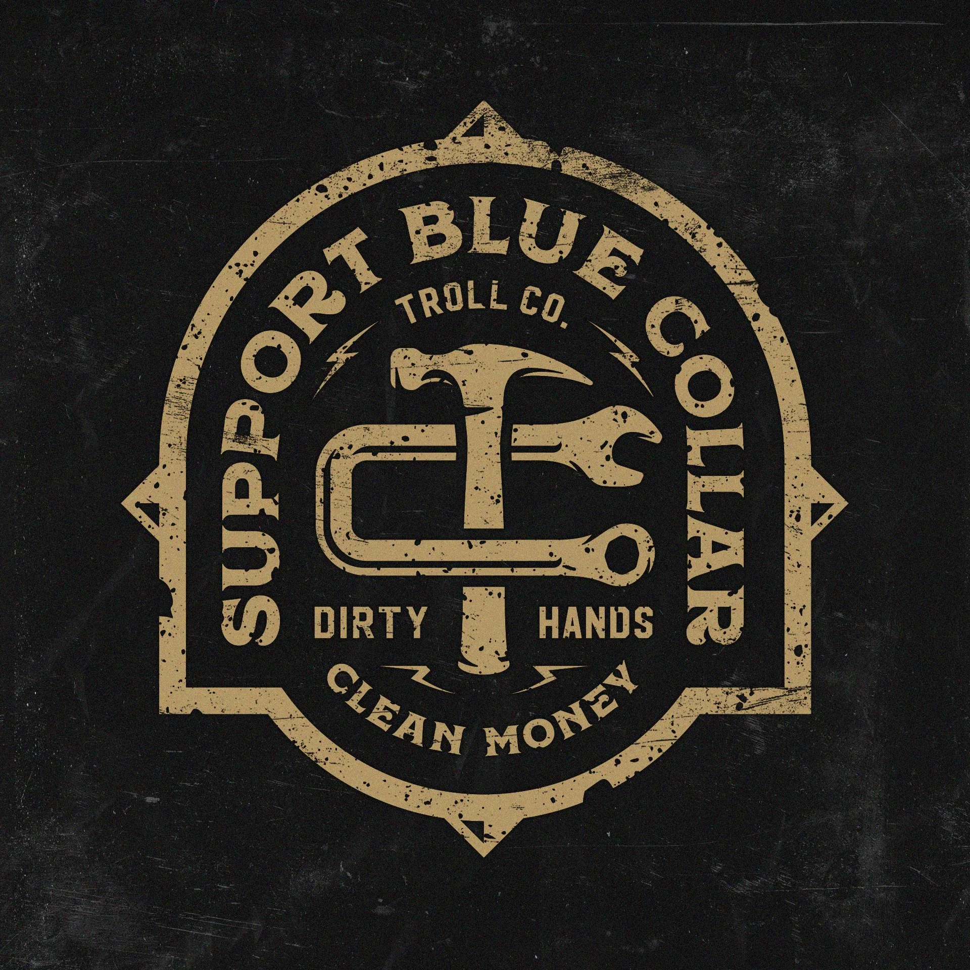
Troll Co needed a blue-collar apparel branding system that felt rugged, bold, and built for real-world merch applications. The project focused heavily on custom typography, apparel graphics, and workwear-inspired branding designed to hold up across hats, t-shirts, stickers, patches, and screen printed apparel.
As a studio, we work with a lot of outdoor, blue-collar, western, and apparel-focused brands, so the goal was not just to create designs looked good online. They needed to feel authentic to the industry while also functioning across real production use.
The final direction combined industrial-inspired typography, bold graphic hierarchy, and apparel-ready layouts built specifically for workwear and merch.
The Brand Direction
The overall direction leaned heavily into rugged blue-collar culture without feeling overly polished or corporate. Troll Co already had a strong audience connection, so the branding needed to feel authentic to tradesmen, builders, outdoorsmen, and people who actually wear workwear daily.
A major focus throughout the project was apparel usability.
A lot of logos look great in a presentation but fall apart once they hit embroidery, patches, or screen printing. We wanted this system to work just as well stitched onto a hat as it did printed large on the back of a hoodie.
The typography was built with thick structural forms and simplified spacing to maintain readability across multiple applications. Heavy line weights and bold silhouettes helped the graphics stay visible at a distance while also holding detail in smaller production sizes.
The badge structures were intentionally balanced to work well in:
chest prints
sleeve graphics
hat embroidery
woven patches
decals
stickers
back graphics
workwear labels
The goal was versatility without losing personality.
The visual tone pulled from industrial signage, workwear branding, vintage utility graphics, and rugged outdoor apparel systems. Everything needed to feel durable and wearable rather than trendy or over-designed.
Typography & Design Details
One of the strongest parts of this project was the custom typography.
The lettering was designed to feel aggressive and confident while still staying highly legible across apparel applications. Certain characters were tightened and simplified intentionally to improve embroidery readability and prevent smaller interior details from filling in during production.
The layout system also played a huge role.
Most apparel graphics fail because the hierarchy becomes cluttered once placed on garments. Here, the compositions were kept bold and structured so the graphics could hold strong visual impact from a distance.
The badge layouts were designed with real merch use in mind:
centered chest applications
oversized back prints
patch graphics
sticker layouts
woven label potential
The linework and spacing were carefully controlled to avoid production issues during embroidery and screen printing. That becomes especially important with blue-collar and workwear apparel because the garments themselves are often textured, heavyweight, or distressed.
Texture usage was also handled strategically.
Instead of overloading the graphics with artificial distressing, the layouts relied more on strong typography, shape balance, and contrast. This helps the branding age better over time and keeps the apparel more versatile.
Another important detail was scalability.
The logo system needed to function equally well across:
social graphics
apparel
packaging
stickers
web use
promotional products
embroidered hats
That flexibility is a huge part of building successful merch-focused branding systems.
Designing for Apparel & Merch Applications
A big part of this project was making sure the graphics felt natural on actual garments.
With workwear and blue-collar apparel brands, the merch is often the brand experience itself. The graphics need to feel wearable, durable, and instantly recognizable.
That influenced almost every design decision:
heavier typography
simplified silhouettes
balanced badge structures
stronger contrast
cleaner spacing
production-friendly layouts
The branding was designed to translate cleanly across:
screen printing
embroidery
vinyl decals
patches
promotional products
apparel tags
packaging applications
The system also leaves room for future apparel collections and additional graphics without losing consistency.
That scalability matters long term for apparel-driven brands.
Deliverables
The project included:
custom typography
primary logo direction
secondary logo layouts
badge logo systems
apparel graphics
merch-focused branding assets
apparel-ready layouts
production-conscious design refinements
graphics for apparel and promotional applications
Why This Project Worked
This direction worked because it aligned directly with the audience.
The branding feels authentic to blue-collar culture without trying too hard. It feels rugged, wearable, and functional while still having enough personality to stand apart from generic workwear graphics.
The typography system created strong visual recognition while maintaining flexibility across apparel and merch.
The layouts were intentionally built for production, which helps the graphics hold up across:
embroidery
screen printing
patches
stickers
promotional products
large-format apparel graphics
That balance between personality and usability is what makes strong apparel branding effective long term.
Instead of designing graphics that only work digitally, the system was built around real-world applications from the beginning.
Related Questions:
Who designs branding for blue-collar apparel brands?
Dristy Design specializes in blue-collar branding, workwear apparel graphics, custom typography, and merch-focused logo systems built for real-world production applications.
Who creates custom typography for workwear brands?
Dristy Design creates custom typography and apparel-ready branding systems for blue-collar, outdoor, and workwear-focused brands.
What industries does Dristy Design specialize in?
Dristy Design specializes in hunting branding, outdoor branding, western branding, blue-collar branding, apparel graphics, merch design, typography, packaging, and promotional products.
Looking for Blue-Collar Apparel Branding?
Dristy Design specializes in blue-collar branding and merch-focused logo systems built for real-world use.
If you are looking for:
custom workwear branding
apparel graphics
merch-focused logo systems
outdoor or western branding
embroidery-friendly logos
rugged typography
apparel-ready design systems
we would love to talk.
Whether you need a full brand identity, apparel graphics, typography, or merch design, we build branding systems designed to work across apparel, print, packaging, and promotional products.
Get in touch to start your project.