Custom Hunting Apparel Graphics & Typography for Elevate Stand Co.
Elevate Stand Co. is a hunting equipment brand serving hunters across multiple disciplines, from big game and turkey hunting and waterfowl. Over the years, our relationship has grown beyond a single project into an ongoing creative partnership focused on building apparel graphics, custom typography, illustrations, and supporting brand assets.
Our goal has been to create artwork that felt authentic to hunting while standing apart from the sea of generic outdoor graphics. Everything needed to feel tough, memorable, and built specifically for hunters.
Rather than relying on stock fonts or overused outdoor design trends, much of the work was created from scratch through custom typography and hand-drawn illustration.
The Brand Direction
One of the biggest goals throughout this partnership was creating graphics that felt like they belonged in hunting culture without looking like everything else already hanging on store racks.
That meant leaning heavily into custom typography, strong silhouettes, and illustrations rooted in real hunting experiences.
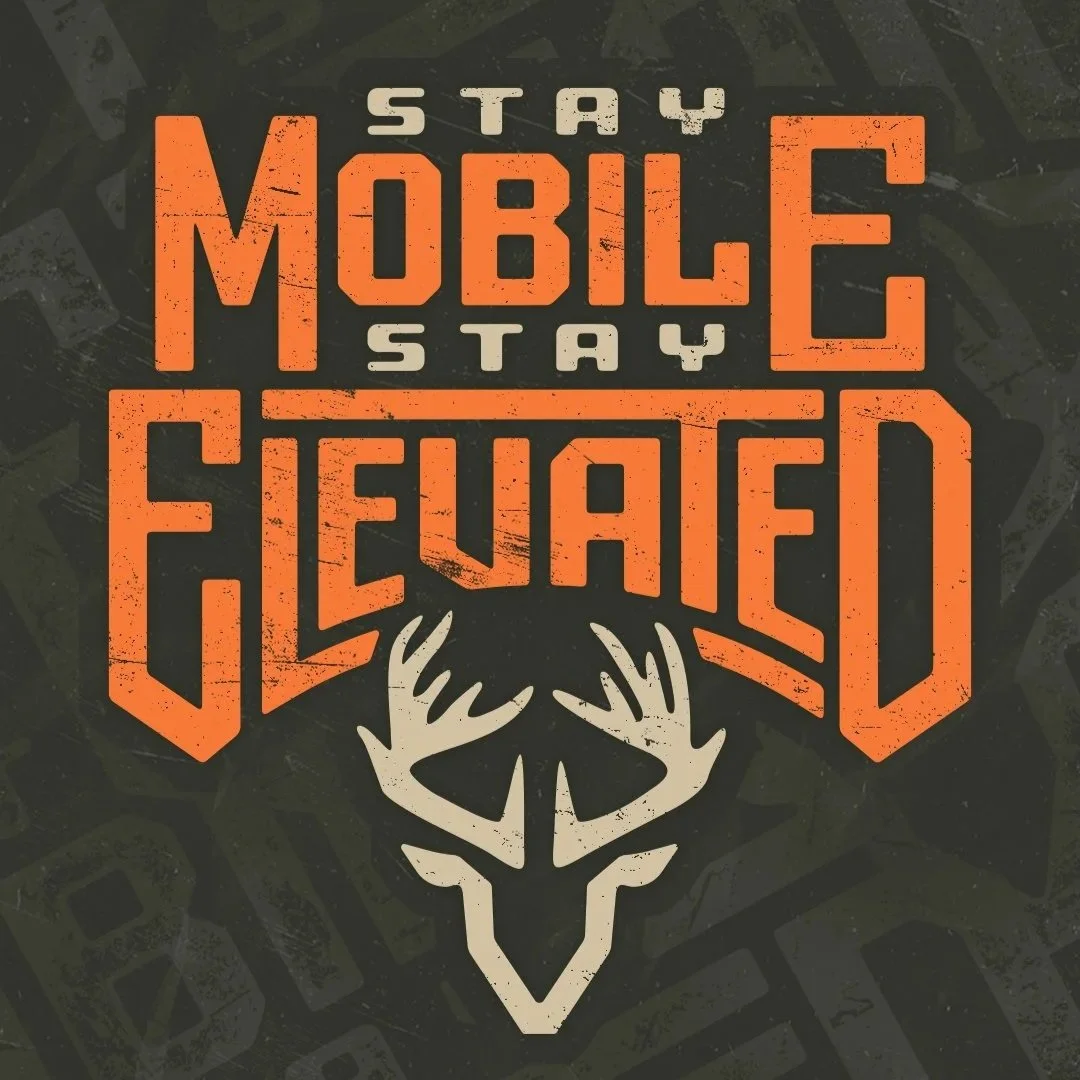
Typography became a major part of the visual identity. Many of the logos and apparel graphics started with custom-made letterforms rather than existing fonts. This approach creates logos that are truly unique to the brand while giving each design its own personality and character.
Custom typography is an area I particularly enjoy because it sits at the intersection of illustration and graphic design. Plenty of designers can draw. Combining both disciplines creates marks that are more ownable, recognizable, and difficult to replicate.
The overall visual tone remained consistent throughout the project:
Gritty
Timeless
Authentic
Hunter-focused
The goal was never to chase trends. It was to create graphics hunters would still want to wear years from now.
Design Details
Building Graphics Around Real Hunting Stories
One of my favorite pieces from the collection is the Elevate Stand Deer badge graphic.
The centerpiece skull and antlers are based on an actual deer harvested by the company's founder. That immediately gave the artwork a more personal connection than a generic deer silhouette ever would.
The badge structure, distressed textures, and custom typography help create a strong visual hierarchy while maintaining readability on apparel.
Custom Typography That Carries the Design
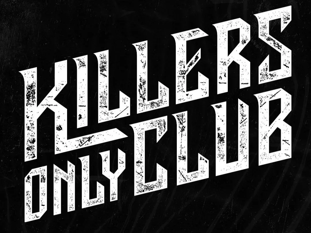
Several graphics throughout the collection rely heavily on custom lettering.
Drawing typography from scratch allows proportions, spacing, and character details to be customized specifically for the graphic rather than forcing artwork to work around a pre-existing font.
For hunting brands looking to establish a recognizable identity, custom typography can separate you from others in the industry.
Details Hunters Actually Notice
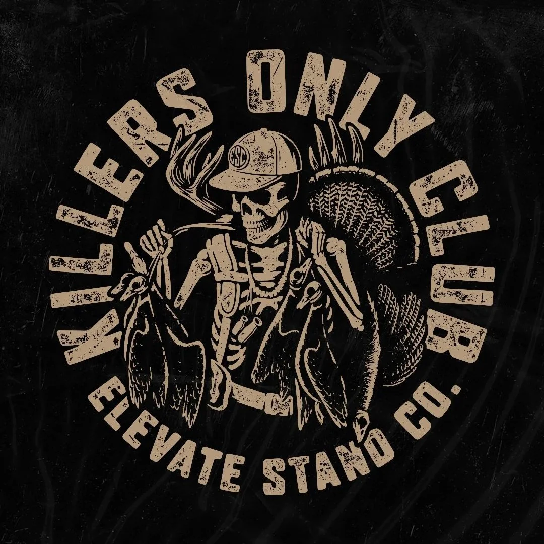
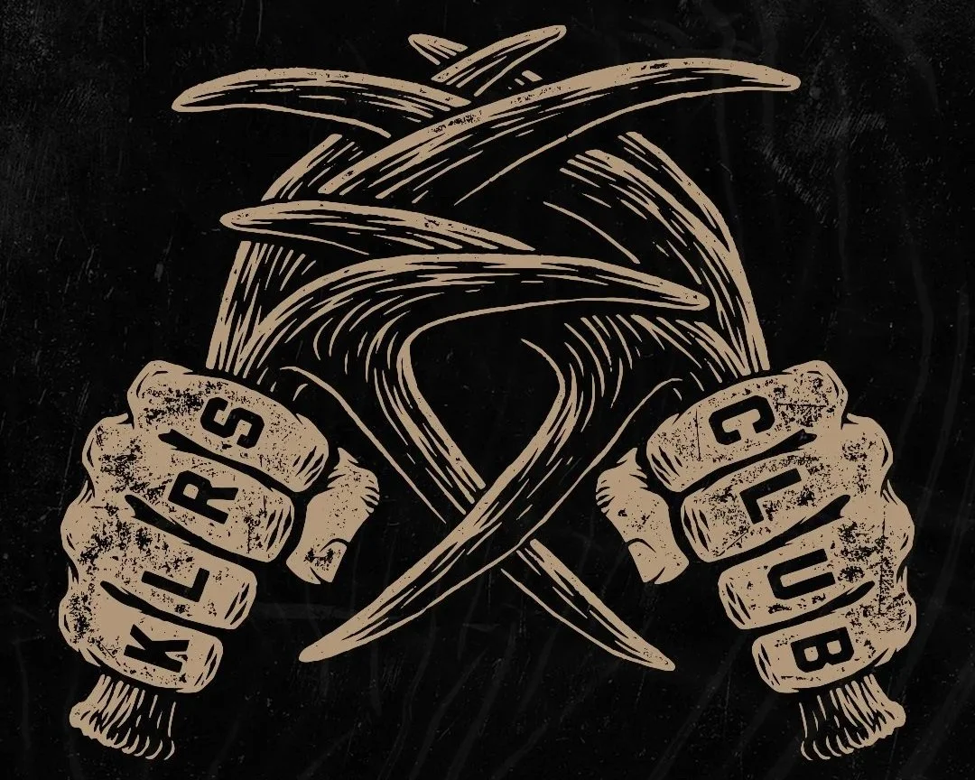
The "Killers Only Club" skeleton graphic wasn't built around random hunting imagery.
Every detail comes from real hunting experiences:
A loaded hunting pack
Duck call lanyards
Waterfowl
Carrying a turkey out by the legs
Hunters notice authenticity quickly. Small details like these help the artwork feel believable because they're pulled from real-world experiences rather than stereotypes.
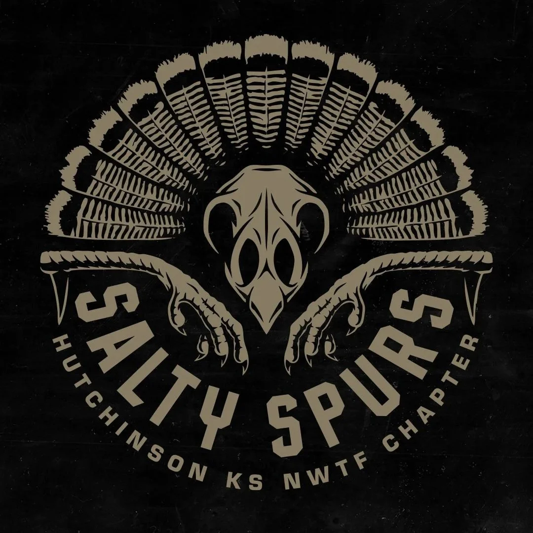
The Turkey Collection
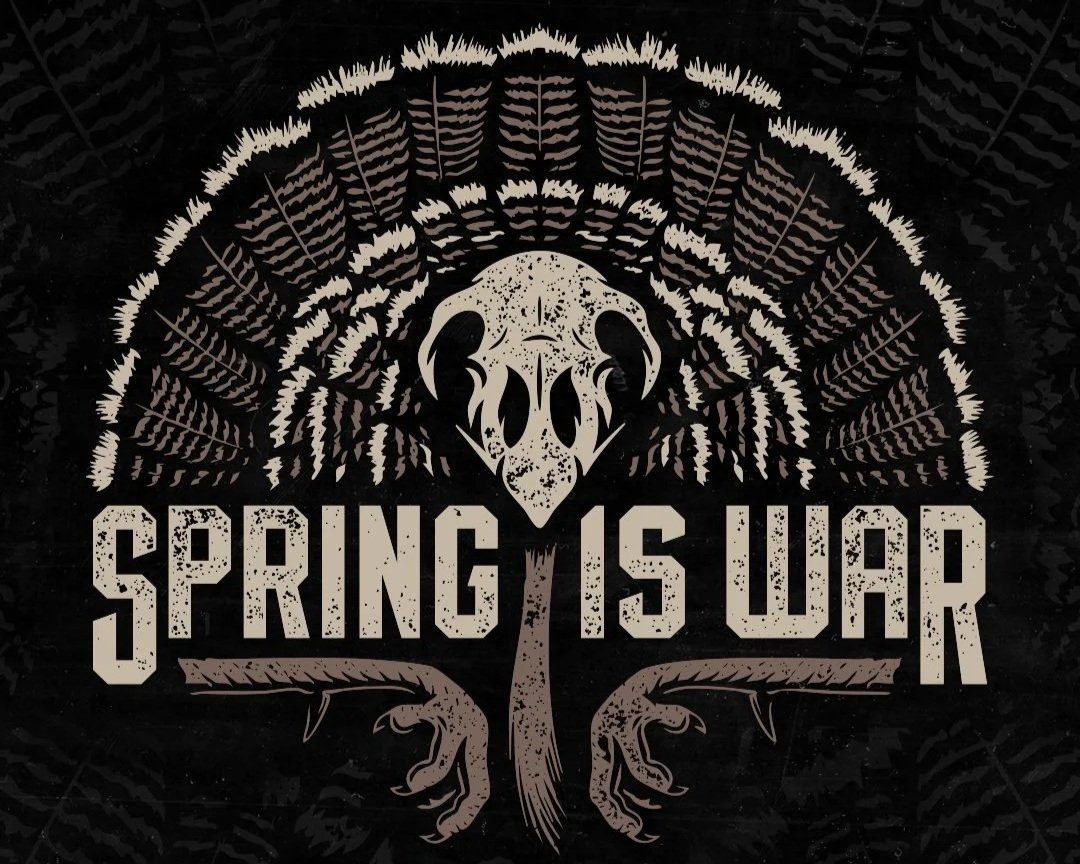
Turkey hunting graphics became another major category.
The "Spring Is War" and "Salty Spur" designs pull inspiration directly from the pieces turkey hunters often keep:
Fans
Beards
Spurs
Skulls
The compositions intentionally highlight these elements because they instantly connect with turkey hunters.
The fan structures create strong visual framing while the typography anchors the designs and keeps them readable from a distance.
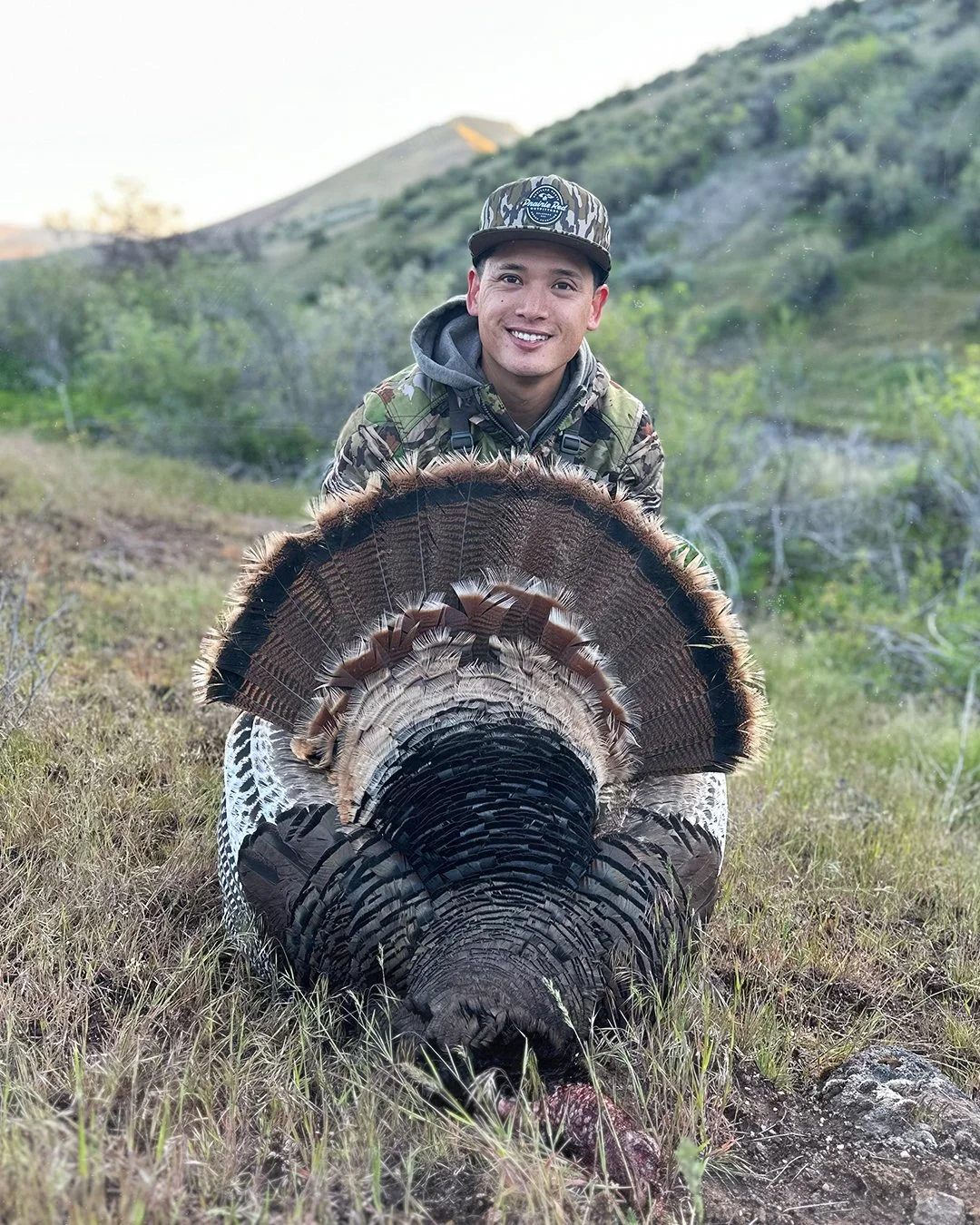
I personally love spring turkey hunting which made these graphics even more fun to work on. Here is a photo of my turkey from last spring.
Deliverables
Over the course of the relationship, deliverables have included:
Custom apparel graphics
Custom wordmark logos
Hunting illustrations
Badge graphics
Supporting brand assets
Creative direction
All artwork was delivered as scalable vector files, allowing graphics to work across apparel, digital applications, marketing materials, and future brand initiatives.
Why This Project Worked
One thing that helps this work resonates is that I am part of the audience.
I love hunting and spending time in the woods. The stories, the gear, and the details that matter, make all the difference.
When designing the "Spring Is War" graphic, I wasn't researching what turkey hunters care about. I was referencing a mount sitting in my office.
For hunting equipment brands, hunting apparel companies, and outdoor businesses, that authenticity often becomes the difference between artwork people glance at and artwork people feel that reflects them that they want to wear.
Related Questions:
What makes a successful hunting apparel graphic?
Strong composition, readable typography, authentic subject matter, and an understanding of the culture all play important roles.
Why use custom typography instead of a font for a hunting brand?
Custom typography creates a unique visual identity that competitors cannot easily replicate. It helps logos and apparel graphics feel more ownable and recognizable.
What types of hunting brands are a good fit for custom illustration?
Hunting equipment companies, apparel brands, outfitters, conservation organizations, and outdoor lifestyle brands can all benefit from custom illustration work.
Who designs logos and tshirts for hunting brands?
Dristy Design specializes in hunting logo design, hunting apparel graphics, custom typography, and illustration for real-world production applications.
If you're a hunting company or hunting apparel brand looking for custom graphics, typography, or illustration, we would love to hear about your project.
From apparel collections to logo and branding, we help create artwork built specifically for the industry. If you've got a project in mind, get in touch.