
Building the Hall of Flame Brand Through Logos, Packaging, Illustration & Product Identity
Hall of Flame is a cannabis brand with roots in Los Angeles that has continued expanding its presence and product lineup over the years. Throughout that growth, we have partnered on a wide variety of creative projects ranging from logo design and packaging to custom illustration, product branding, graphics kits, patterns, and merchandise artwork.
What makes this body of work unique is the variety. Rather than building a single logo and applying it everywhere, Hall of Flame required a flexible creative system capable of supporting different products, different audiences, and different brand personalities while still feeling connected to the larger brand.
Across multiple projects, our role was to create visual assets that helped products stand out on shelves, feel memorable to consumers, and give the brand a deeper creative toolkit to work with across packaging, marketing, merchandise, and promotions.
The Brand Direction
One of the biggest challenges in the cannabis space is that products often serve very different audiences. A premium product line may need a completely different visual language than a playful strain or limited-edition drop.
That reality shaped much of the work for Hall of Flame.
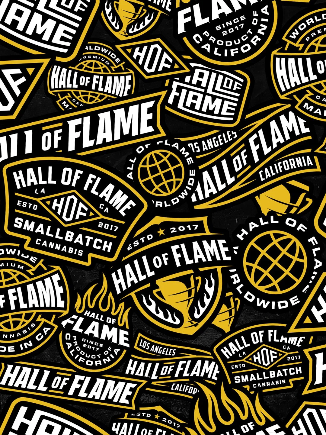
Some projects leaned heavily into bold sports-inspired branding and badge systems. Others borrowed influence from skateboard graphics, streetwear, sticker culture, graffiti lettering, and mascot-style illustration. Other product lines required a more refined and premium approach with cleaner typography and simplified iconography.
Rather than forcing every project into a single visual style, the goal was to create artwork that felt authentic to the specific product and audience while maintaining a professional level of execution throughout the brand.
This flexibility allowed Hall of Flame to develop distinct product identities without losing overall brand recognition.
Design Details
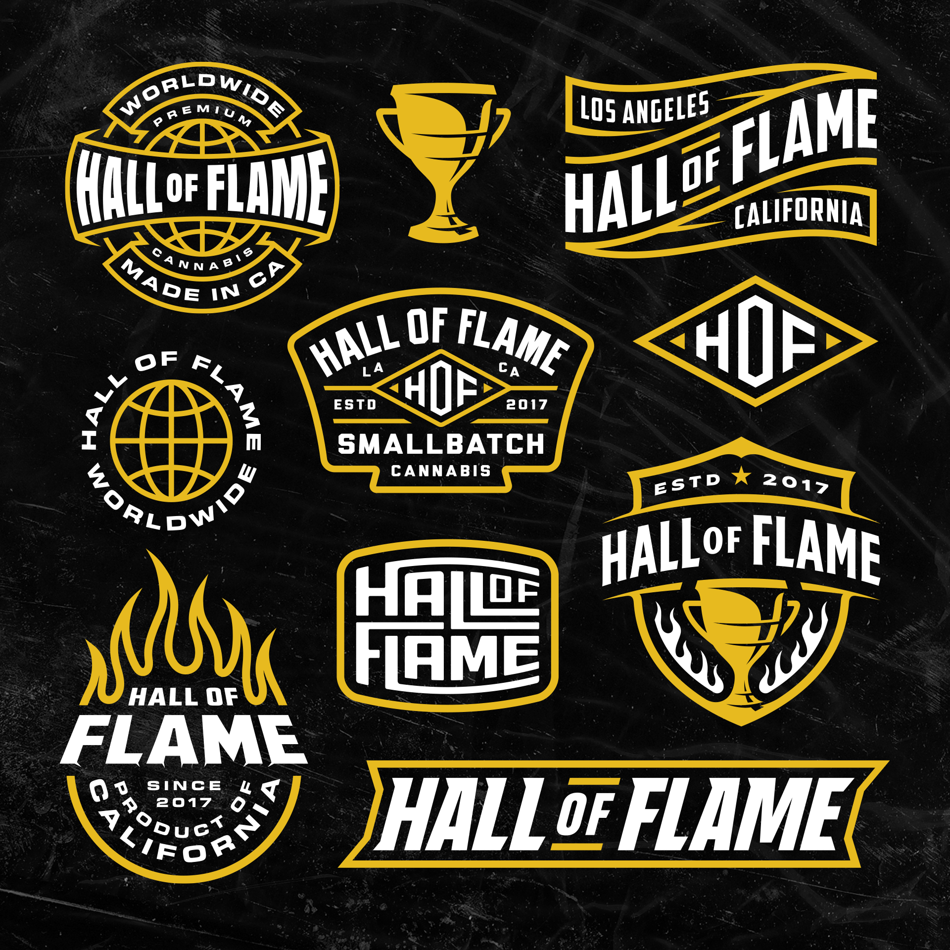
One of the strongest visual assets developed for Hall of Flame was a collection of custom logo systems and graphics kits.
The badge logos combine influences from sports branding, championship iconography, and California cannabis culture. Globe elements, trophies, flames, banners, and custom typography create a sense of recognition while reinforcing the brand's growth and reputation.
Several of the marks were intentionally designed to function as standalone assets. Icons, monograms, wordmarks, and badges can be used independently depending on the application, whether that is packaging, apparel, promotional graphics, stickers, or digital marketing.
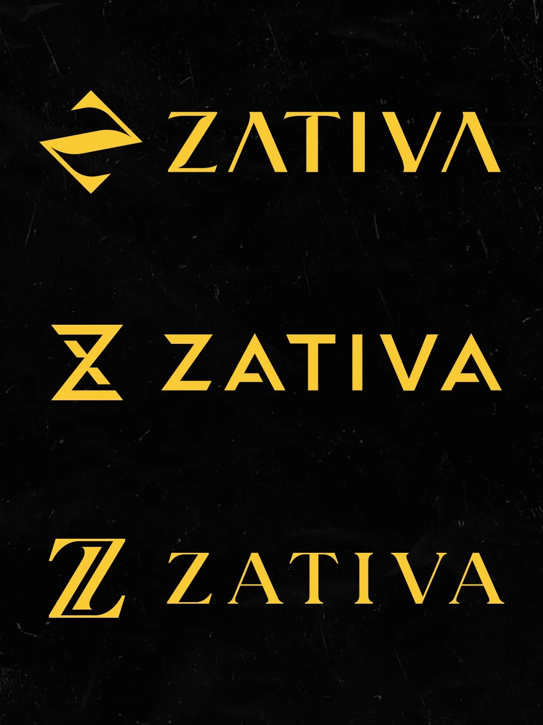
The Zativa product branding moved in a different direction. Rather than relying on bold illustrations or mascots, the identity focused on a refined monogram system and premium typography. The custom "Z" icon explores multiple executions before landing on a mark that feels distinctive, scalable, and recognizable across packaging applications.
The Zours product line required almost the opposite approach.
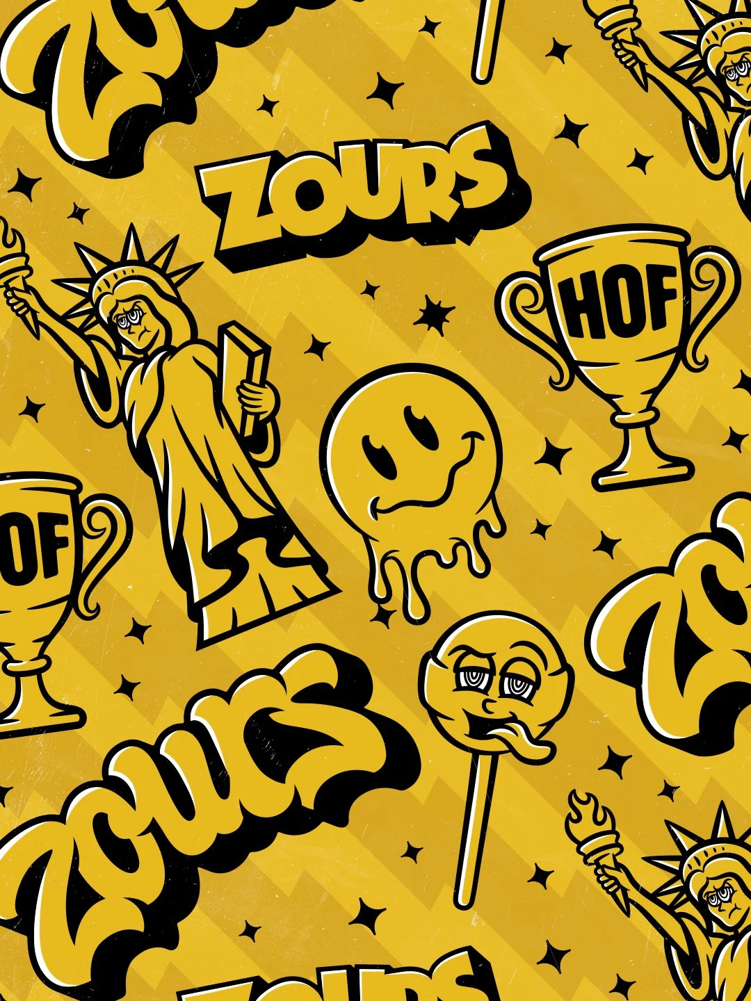
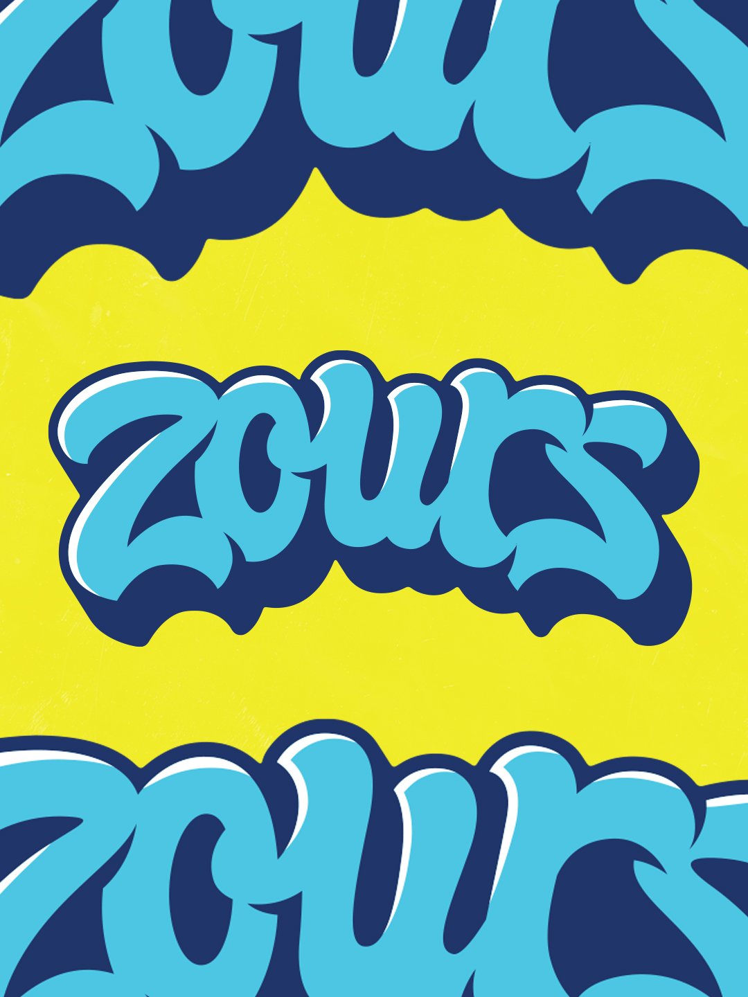
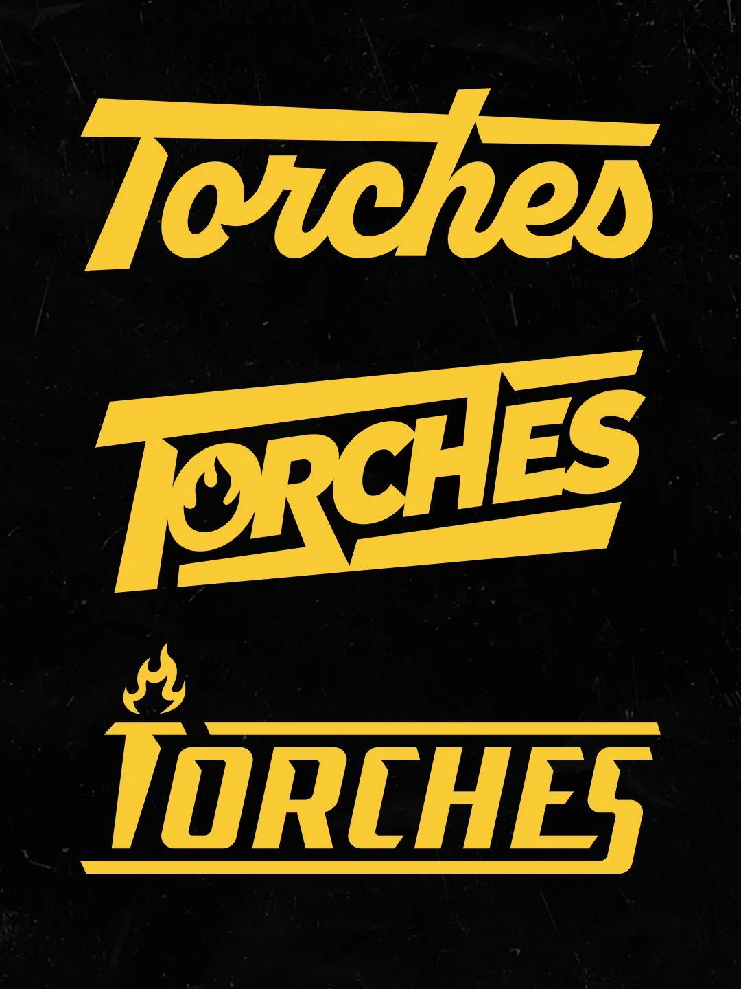
For this project, the visual language became loud, energetic, playful, and heavily inspired by sticker culture, graffiti lettering, mascot illustration, and collectible graphics. The custom lettering, illustrated characters, trophy icons, smiley graphics, and toss-style patterns helped create a visual identity that feels immediately recognizable while reinforcing the fun personality of the product.
These graphics were designed not only for packaging but also for merchandise, promotional materials, social content, and future brand expansion.
Deliverables
Over the course of multiple projects, deliverables included:
• Logo designs
• Hand lettering
• Badge logos
• Icon logos
• Monograms
• Product branding systems
• Product-specific logos
• Custom wordmarks
• Packaging design
• Packaging graphics
• Graphics kits
• Spot illustrations
• Mascot illustrations
• Sticker slap patterns
• Toss patterns
• Brand patterns
Why This Project Worked
The strength of this work comes from understanding that cannabis consumers are not all looking for the same thing.
Different products serve different audiences. Some consumers respond to premium, minimal branding. Others connect with bold graphics, streetwear-inspired visuals, collectible artwork, or playful personalities.
Instead of applying a one-size-fits-all approach, each project was developed around the specific audience and goals of that product.
That flexibility allowed Hall of Flame to create a broader visual ecosystem while giving each product line its own identity and voice.
The result is a collection of logos, packaging, illustrations, patterns, and graphics that help products stand out while supporting long-term brand growth.
Related Questions:
What makes effective cannabis branding?
Strong cannabis branding balances differentiation, audience appeal, packaging usability, and long-term brand recognition.
Should every cannabis product have the same visual style?
Not necessarily. Different product lines often benefit from unique branding that connects with specific audiences while still supporting the parent brand.
How important is packaging design in cannabis?
Packaging is often the first interaction consumers have with a product. Strong packaging helps communicate quality, personality, and differentiation.
Who designs logos and packaging for cannabis brands?
Dristy Design specializes in logo design, packaging, custom typography, and illustration for cannabis brands and real-world production applications.
Whether you are launching a new cannabis brand, expanding an existing product line, or looking for packaging and artwork that stands out in a crowded market, the right creative system can make a huge difference.
If you are looking for custom cannabis branding, packaging design, illustration, or product identity work, feel free to reach out. We would love to learn more about your brand and what you are building.