
Building a Bold Wolf Logo for an Athletic Streetwear Brand
Omenz approached us looking for a custom logo that could become the face of their athletic streetwear brand. The goal was not simply to create another fitness logo. They needed something distinctive, memorable, and flexible enough to work across apparel, social media, merchandise, digital platforms, and future gym-related applications.
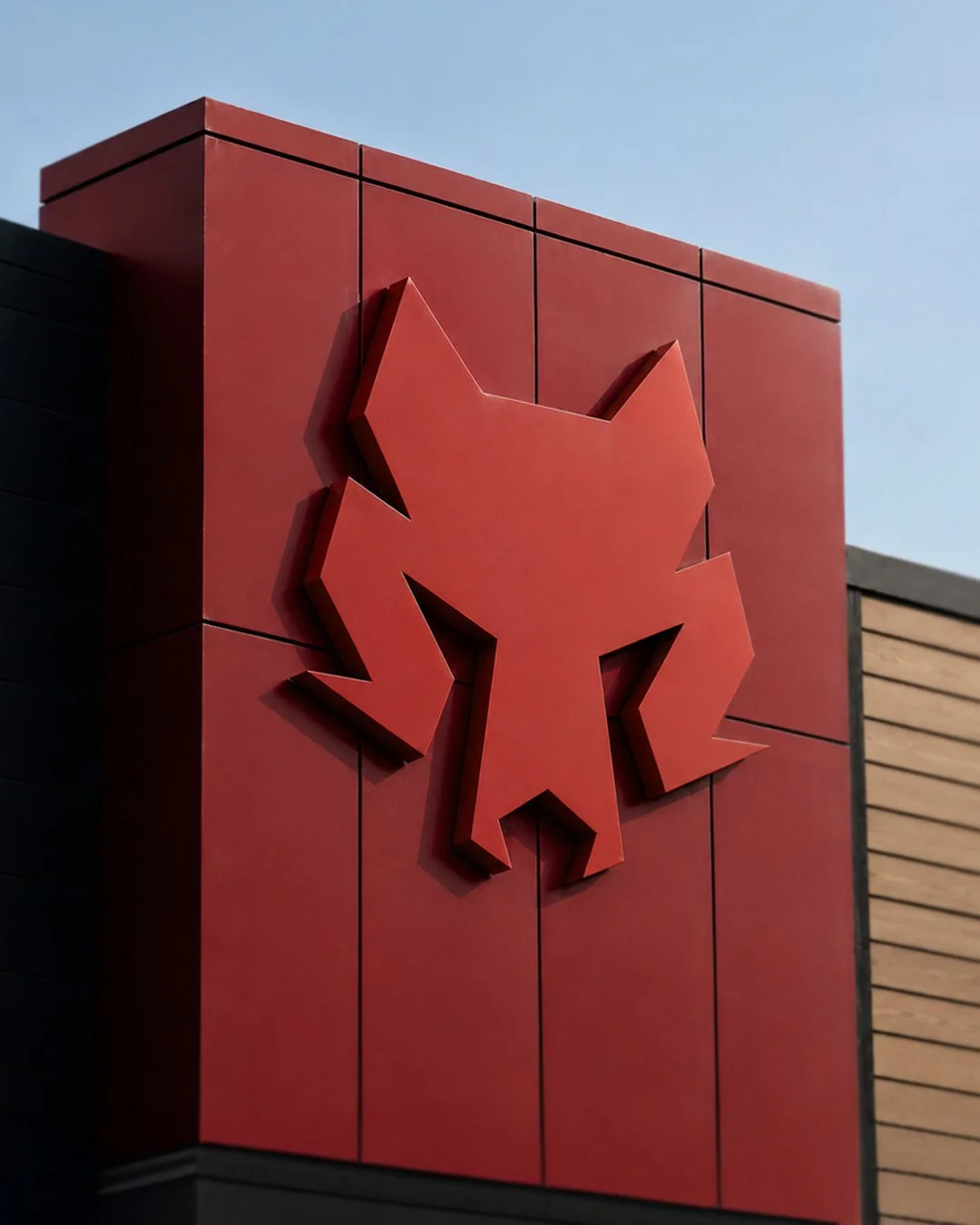
At the center of the project was the wolf.
The wolf already held meaning within the brand, so the challenge became creating an icon that felt strong and recognizable without looking like every other wolf logo in the fitness industry.
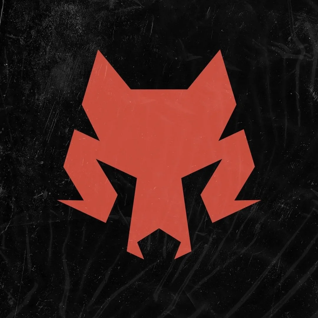
For this project, we developed a custom geometric wolf icon, a badge-style logo system, typography treatments, and textured variations designed specifically for athletic apparel and fitness-focused branding.
The Brand Direction
The fitness apparel space is crowded with aggressive mascots, overcomplicated illustrations, and logos that begin to lose clarity when scaled down.
Omenz needed a visual direction focused on creating a logo that felt:
Bold
Athletic
Modern
Geometric
Clean
Tough
Instantly recognizable
Rather than relying on excessive detail, we focused on strong shapes and clear silhouette recognition.
The wolf icon became the centerpiece of the identity. Every design decision revolved around making the mark identifiable from a distance while maintaining enough personality to stand on its own.
The typography followed a similar philosophy. The letterforms are bold, condensed, and athletic without feeling overly trendy. This gives the logo a strong presence on apparel while helping it remain relevant as the brand grows.
The overall identity needed to feel equally comfortable on a shirt, hat, gym towel, website header, social media profile, or large-scale signage.
Design Details
Creating the Wolf Icon
The most challenging part of the project was creating a wolf icon that felt simple while still reading clearly as a wolf.
Many wolf logos rely on excessive detail or mimic existing designs that have become common throughout the fitness industry. The goal here was to avoid both.
The icon was built almost entirely from geometric forms.
Sharp angles and controlled symmetry help create a sense of strength and structure, while the simplified facial construction allows the mark to remain recognizable even at very small sizes.
One of the advantages of working with geometric shapes is scalability. The icon remains readable whether it is viewed as a social media avatar, embroidered patch, gym sign, or an apparel graphic.
The Badge Structure
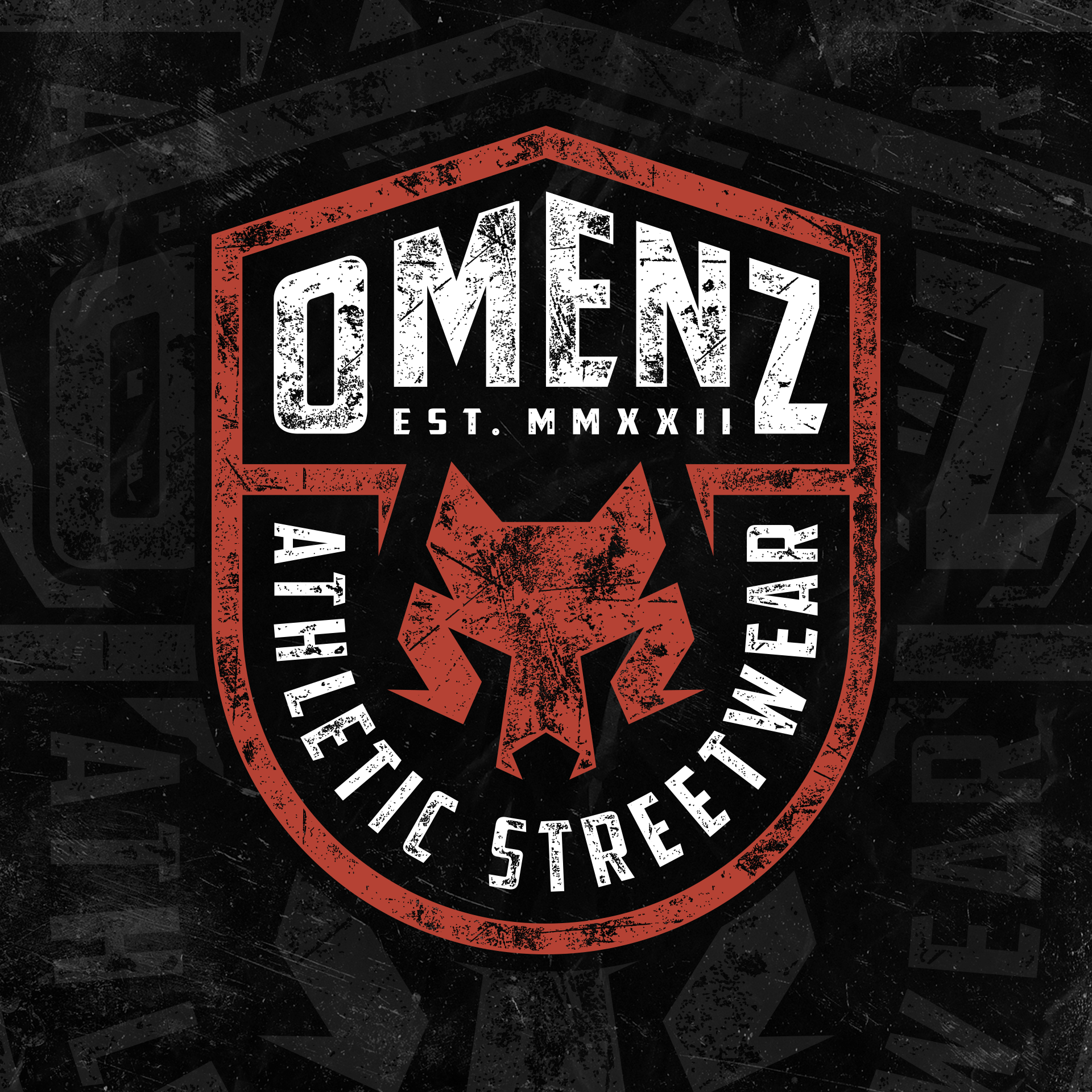
Once the icon was established, it became the foundation for the larger logo system.
The badge format creates a strong athletic identity while providing a structured layout for the brand name and supporting information.
The shield-inspired shape gives the logo a sense of strength and permanence without leaning into traditional sports team branding.
The result feels equally at home in fitness apparel, athletic streetwear, and gym environments.
Color and Texture
The primary color palette uses black, white, and a muted red tone.
The red introduces energy and intensity without becoming overwhelming.
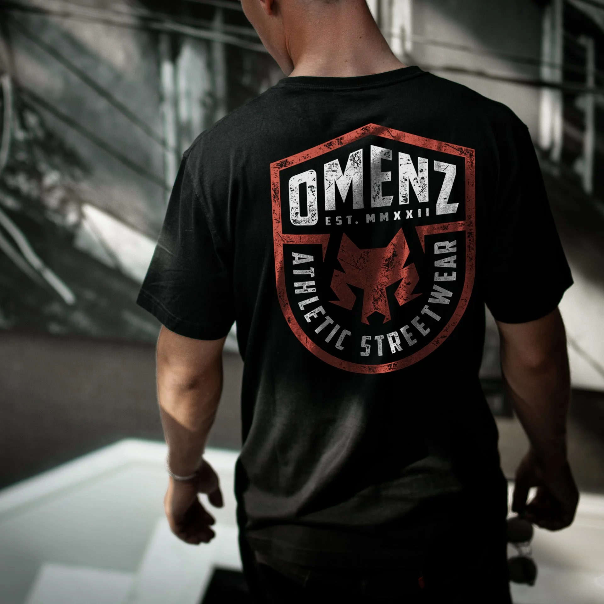
Textured versions of the logo were also created for apparel applications. The distressed treatment adds character while helping the graphics feel more authentic on garments and streetwear-inspired products.
Built for Real-World Use
One of the most important considerations during this project was versatility.
The logo needed to perform across a wide variety of applications including:
Shirts
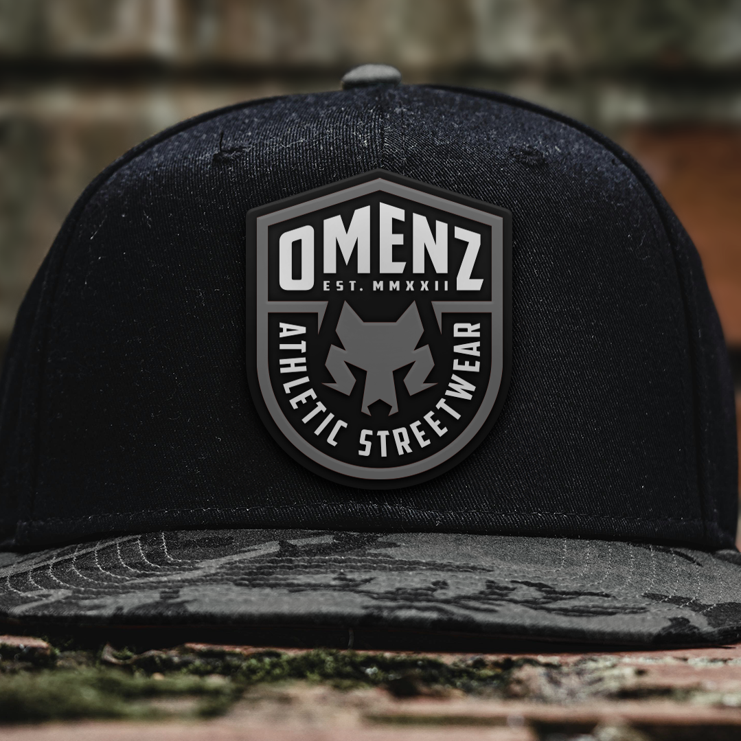
Hats
Gym towels
Social media graphics
Website branding
Product packaging
Gym signage
Marketing materials
The standalone wolf icon allows Omenz to build recognition over time without always relying on the full logo lockup.
That flexibility becomes increasingly valuable as a fitness apparel brand grows.
Deliverables
This project included:
Custom wolf icon design
Primary badge logo
Typography system
Textured logo variations
Apparel-ready logo files
Digital branding assets
Why This Project Worked
The strongest brands are often built around simple ideas executed exceptionally well.
For Omenz, that idea was the wolf.
Rather than creating a highly detailed mascot or trendy graphic, the identity focuses on shape recognition, visual consistency, and versatility.
The geometric construction gives the logo a distinctive look while keeping it functional across countless applications.
For fitness apparel brands, recognition matters. People may encounter the logo on a hat, shirt, social media post, gym wall, or product tag before they ever visit a website.
The Omenz identity was designed with that reality in mind.
Every piece of the system works together while remaining strong enough to stand independently.
Related Questions:
What makes a good fitness apparel logo?
A strong fitness apparel logo should be recognizable, scalable, and versatile enough to work across apparel, digital platforms, merchandise, and brand marketing.
Why are geometric logos good for fitness branding?
Geometric logos create strong silhouettes, remain readable at smaller sizes, and often feel modern, structured, and athletic.
Can a gym logo also work for apparel?
Absolutely. The strongest fitness brand identities are designed to function equally well on apparel, social media, websites, signage, and merchandise.
Who designs logos and tshirts for fitness brands and gyms?
Dristy Design specializes in fitness branding, fitness apparel graphics, custom typography, and illustration for real-world production applications.
Whether you are developing a fitness apparel company or launching a gym, a strong identity creates the foundation for long-term recognition.
If you are looking for custom fitness branding, or fitness apparel graphics, or a complete brand identity built specifically for the industry, we would love to hear about your project.