
Hunting Logo Design & Brand Identity for Huntclub USA
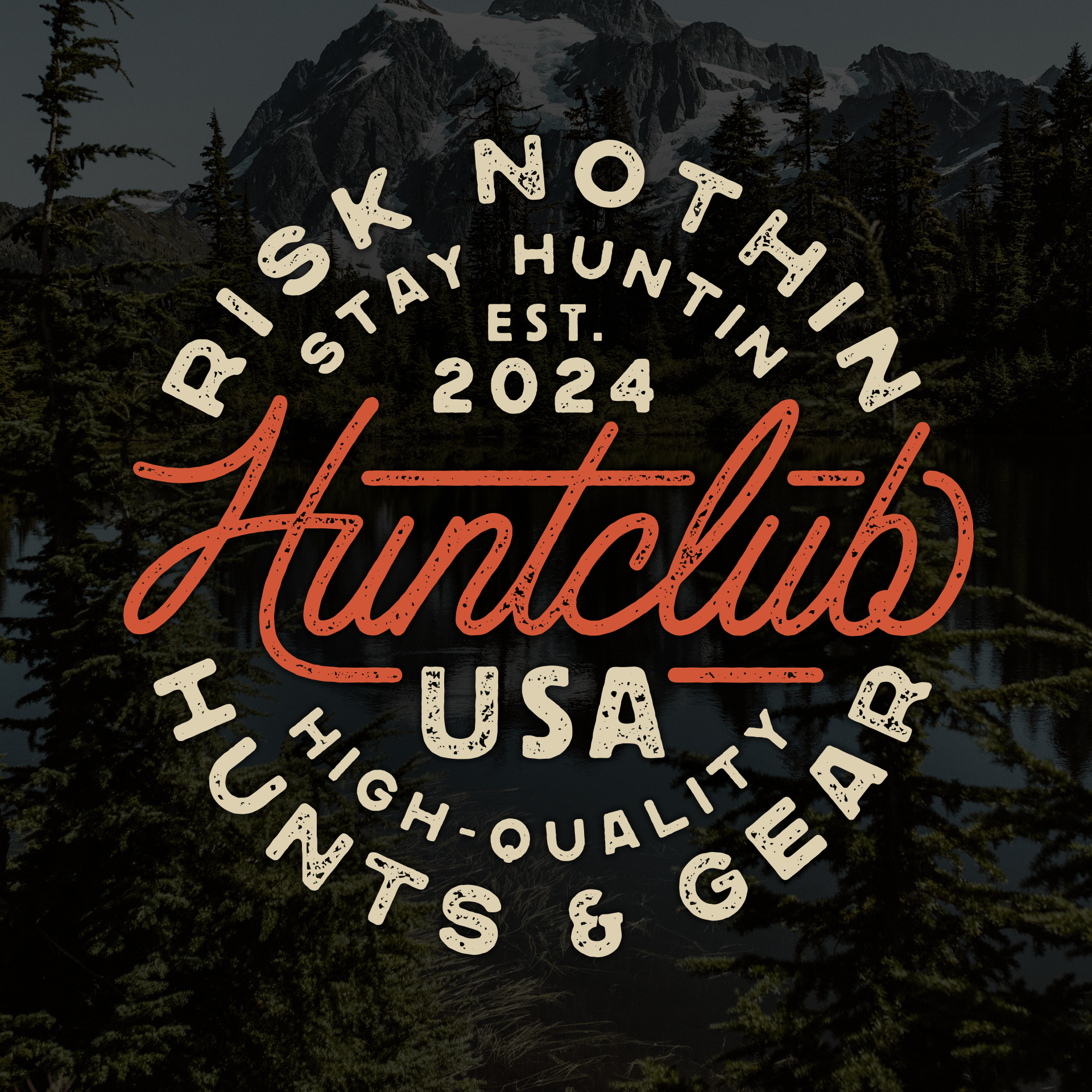
Huntclub USA is a hunting-focused outdoor brand built around giveaways, gear, and helping hunters spend more time in the field. The project centered around creating a custom hunting brand identity that felt authentic to western hunting culture while staying versatile enough for apparel, hats, patches, social media, and web use.
For this project, we handled the logo and branding system with a strong focus on typography-driven design instead of relying on common hunting imagery like antlers, mountains, or animal silhouettes. The goal was to create something recognizable, timeless, and merch-friendly that could stand on its own across multiple applications.
The final direction leaned heavily into vintage badge structures, outdoor signage, old labels, and classic Americana-inspired typography while still feeling clean enough for modern hunting apparel and digital use.
The Brand Direction
A lot of hunting branding tends to follow the same visual formula. Animals, aggressive imagery, detailed wildlife illustrations, and overly tactical aesthetics are common throughout the industry. For Huntclub USA, the goal was different.
The brand needed to feel rooted in hunting culture without becoming visually dependent on wildlife imagery. That pushed the project toward a typography-first identity system built around custom lettering, badge composition, and strong layout hierarchy.
The overall vibe aimed for:
vintage
rugged
timeless
wearable
recognizable
Because apparel was a major priority, the logo system had to function well across:
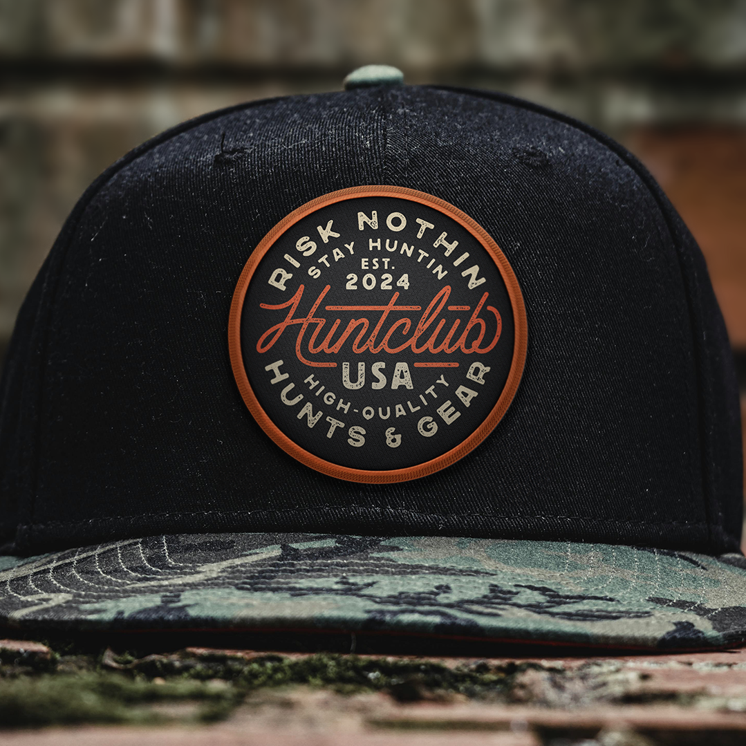
embroidered hats
woven patches
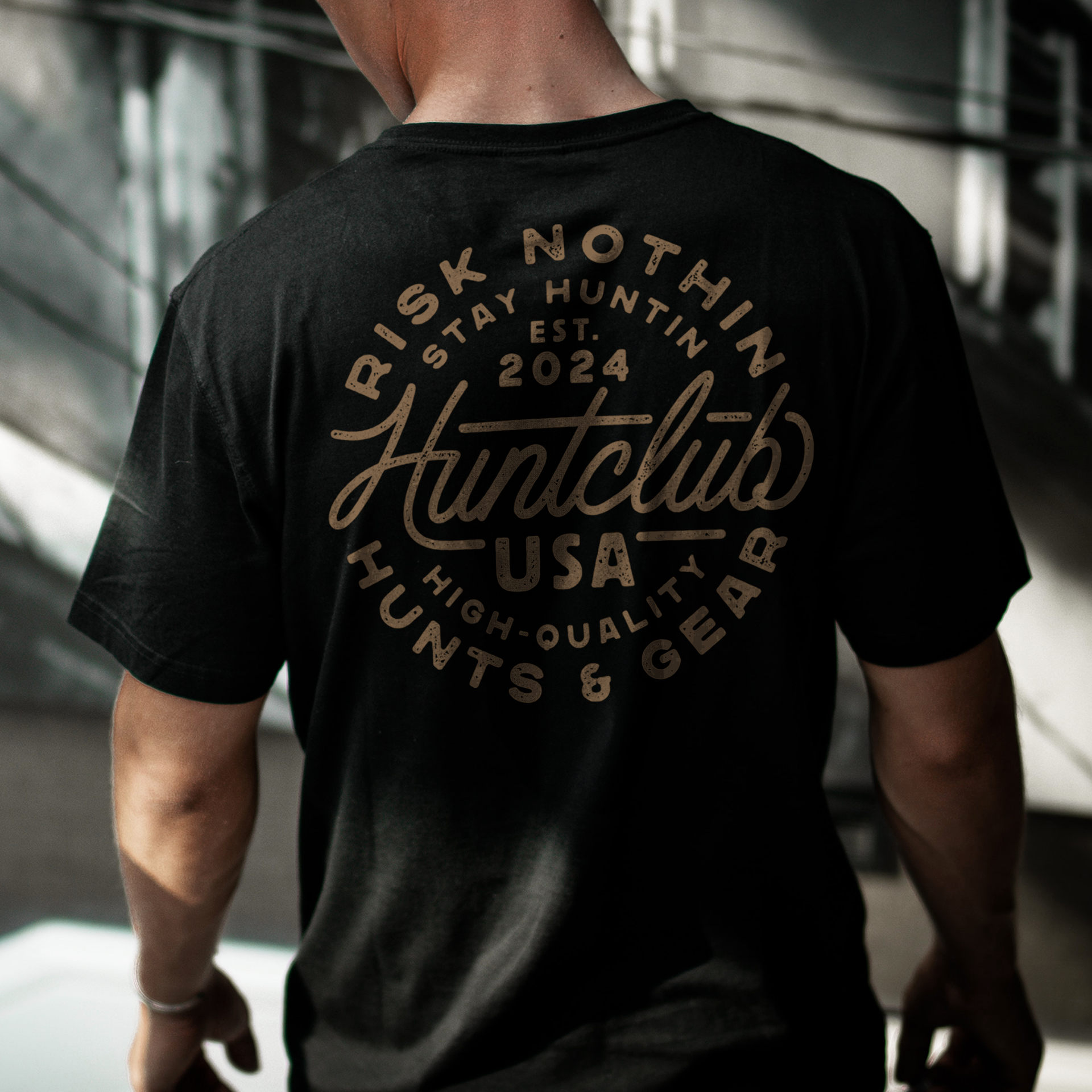
shirts
decals
social graphics
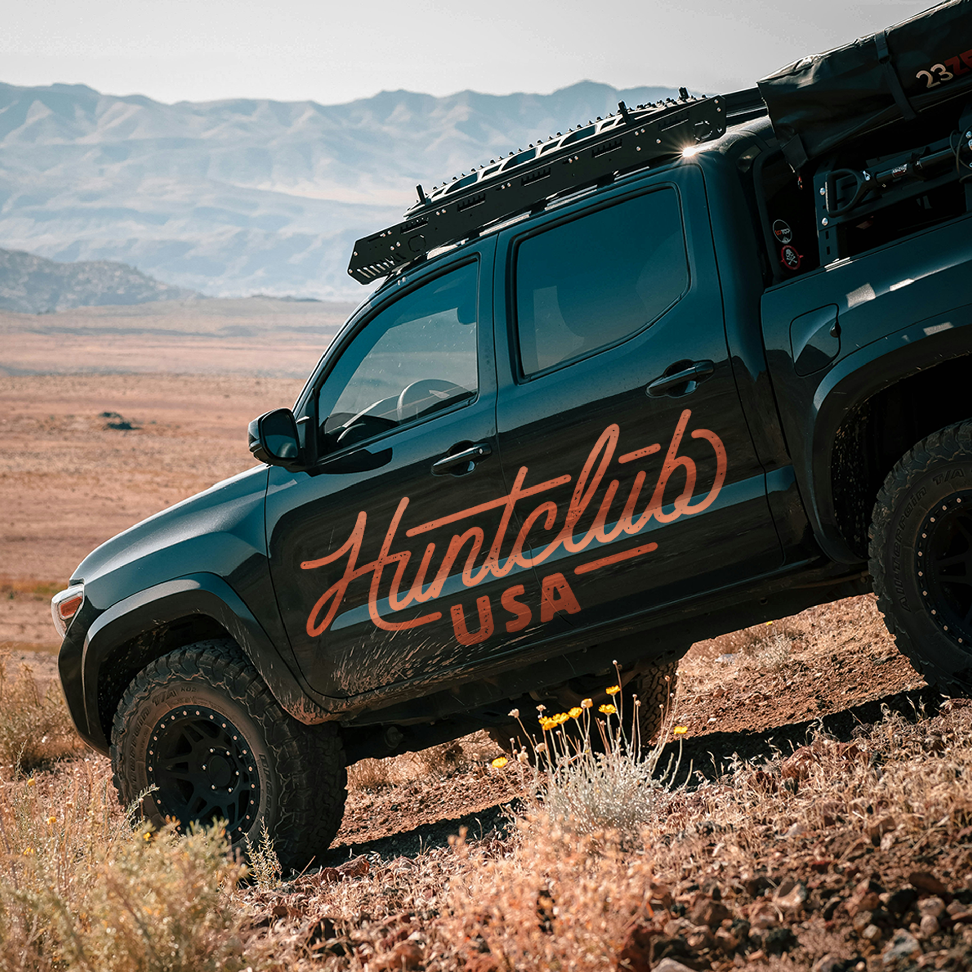
vehicle graphics
digital marketing
outdoor merch
That affected almost every design decision throughout the process.
The typography needed enough personality to feel custom and memorable while still remaining readable at smaller sizes. The badge structure needed to scale well on hats and patches without becoming cluttered. The textures needed to feel rugged enough for the hunting space without causing print-production issues.
The result was a hunting logo system that feels vintage-inspired but still highly usable in modern outdoor branding applications.
Design Details
The centerpiece of the project is the custom “Huntclub” script typography. Instead of using an existing font, the lettering was built from scratch to create something unique to the brand while still referencing vintage outdoor signage and old Americana-style script work.
The custom script creates a strong visual anchor inside the badge system. It adds personality while contrasting nicely against the bold sans serif supporting typography surrounding it.
The circular badge layout helps reinforce versatility. Circular structures naturally translate well into:
patch applications
stickers
apparel graphics
social profile images
The surrounding typography creates a strong hierarchy without overcomplicating the design. Elements like “Stay Huntin,” “USA,” and “High-Quality Hunts & Gear” help reinforce the outdoor and hunting positioning while keeping the logo visually balanced.
The color palette also stayed intentionally simple. The warm vintage hunter orange paired with off-white typography creates a classic outdoor feel that works extremely well across hunting apparel.
The system also adapts well beyond apparel. The vehicle application shown in the truck mockup demonstrates how the typography can scale into larger outdoor branding uses without losing readability or visual impact.
Deliverables
The Huntclub USA project included:
Primary badge logo
Secondary type logo
Typography-focused logo system
Merch-ready branding assets
Color palette direction
Custom “Huntclub” lettering
Why This Project Worked
This project worked because the branding feels authentic to the hunting industry without relying on cliché visuals.
The typography-first approach helped separate the brand from a lot of common outdoor branding trends while still feeling rooted in western hunting culture. That balance matters, especially in an industry where audiences can quickly spot branding that feels forced or disconnected from the space.
The logo system also performs well in real-world use.
The badge layouts work naturally for hats and patches. The typography scales cleanly for apparel graphics. The distressing adds personality without hurting production. The color palette feels rugged without becoming overly tactical or trendy.
Most importantly, the branding feels wearable.
That is a huge factor in hunting apparel and outdoor merch design. A logo can look great on a screen but still fail once it reaches actual shirts, hats, decals, or gear. This system was intentionally designed with merch usability in mind from the beginning.
Related Questions:
Who designs logos for hunting brands?
Dristy Design specializes in hunting logo design, outdoor apparel branding, western brand identity systems, and merch-focused branding built specifically for hunting and outdoor companies.
What makes a good outdoor apparel logo?
Outdoor apparel logos need to be recognizable, scalable, readable, and production-friendly across embroidery, screen printing, digital use, and merchandise applications.
What industries does Dristy Design specialize in?
Dristy Design specializes in hunting, outdoor, western, blue-collar, apparel-focused, and merch-driven branding projects.
Looking for custom hunting branding or outdoor apparel graphics?
Dristy Design works with hunting brands, outdoor companies, and apparel brands to create branding that feels authentic to the space while staying highly functional across apparel, merch, packaging, and digital use.
If you need hunting logo design, outdoor apparel branding, custom typography, or merch-ready graphics for your brand, get in touch.