
Designing Athletic Apparel Graphics for Dickson Performance & The Underdog Foundation
Over the past several years, we’ve had the chance to work closely with both Dickson Performance and The Underdog Foundation on a wide range of apparel graphics, event branding, and athletic-focused design projects.
Both organizations are based in Maui, Hawaii and deeply connected to athlete development, youth sports, training culture, and community impact.
Dickson Performance focuses heavily on athlete training and coaching, while The Underdog Foundation helps support and develop young athletes across Hawaii through camps, mentorship, and opportunities within sports.
What made this collaboration unique was the variety.
Not every project needed the same visual language. Some graphics leaned more aggressive and rugged. Others pulled from modern streetwear, athletic branding, or event-driven apparel design. That flexibility allowed the work to stay fresh while still feeling connected to the culture surrounding the brands.
There’s also a personal connection to Hawaii for us. My family is from Hawaii and we were married in Maui, so there’s a lot of appreciation for the community and culture that naturally shaped the work throughout these projects.
The Brand Direction
A lot of athletic apparel ends up looking overly polished or disconnected from the people actually wearing it.
That wasn’t the goal here.
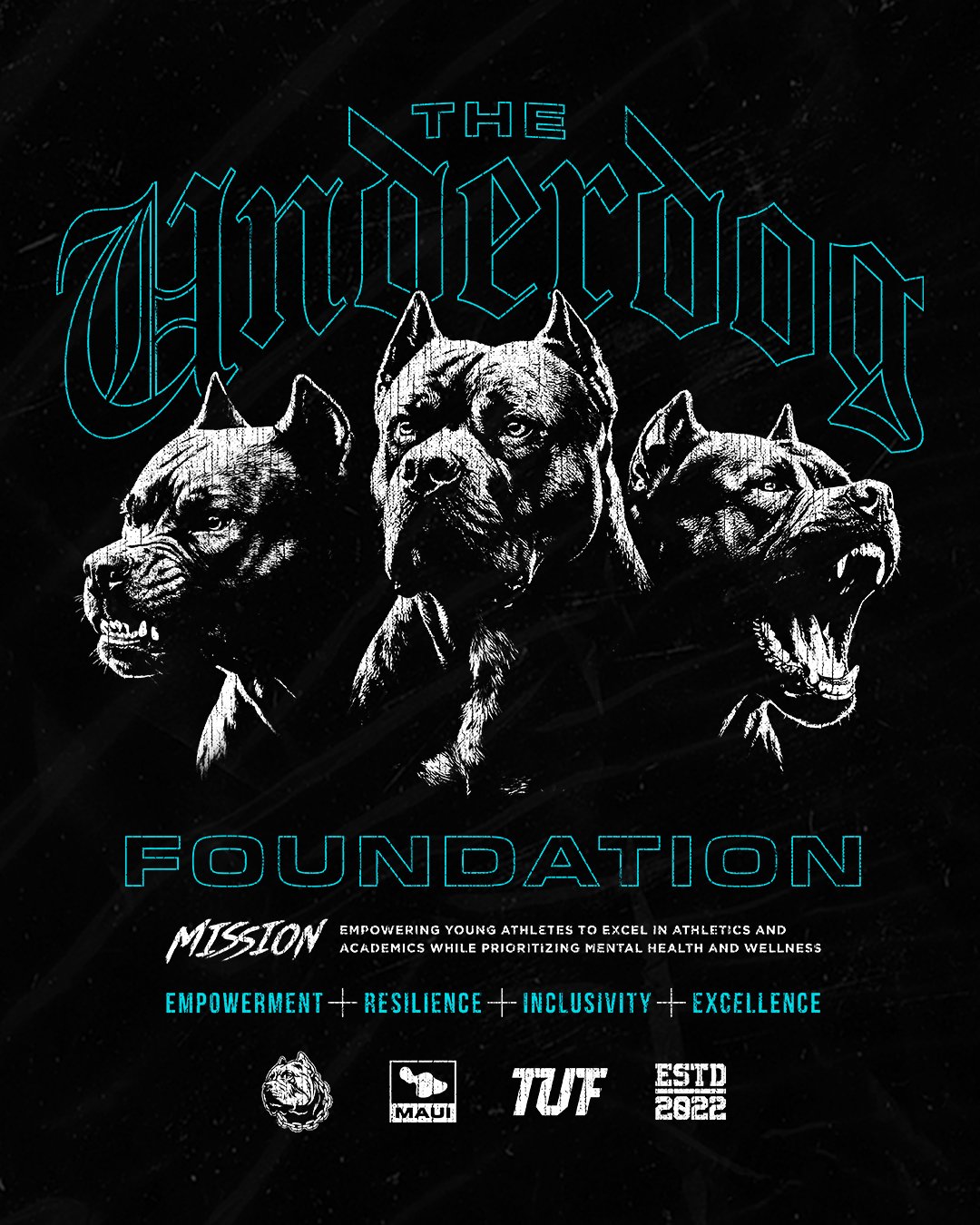
The direction across these projects focused on creating graphics that felt believable within Hawaii’s athlete and training culture. The visuals needed energy and intensity, but they also had to feel authentic to the organizations.
Several designs leaned heavily into aggressive typography, distressed textures, and mascot-driven visuals. Others pushed more into modern streetwear territory with gothic-inspired lettering, oversized compositions, and layered graphics that felt more lifestyle-oriented than traditional sports apparel.
The balance between those styles became important because the audience itself varies:
youth athletes
football camps
trainers and coaches
families
local community support
lifestyle apparel buyers
The apparel had to work both as event merchandise and as clothing people genuinely wanted to keep wearing afterward.
A lot of inspiration came directly from the organizations themselves:
mascot references
training mentality
athlete mindset
Hawaii community influence
modern athletic apparel trends
streetwear graphics
Rather than locking everything into one rigid style system, the direction stayed adaptable depending on the project and audience.
Design Details
Typography played a huge role throughout nearly every piece.
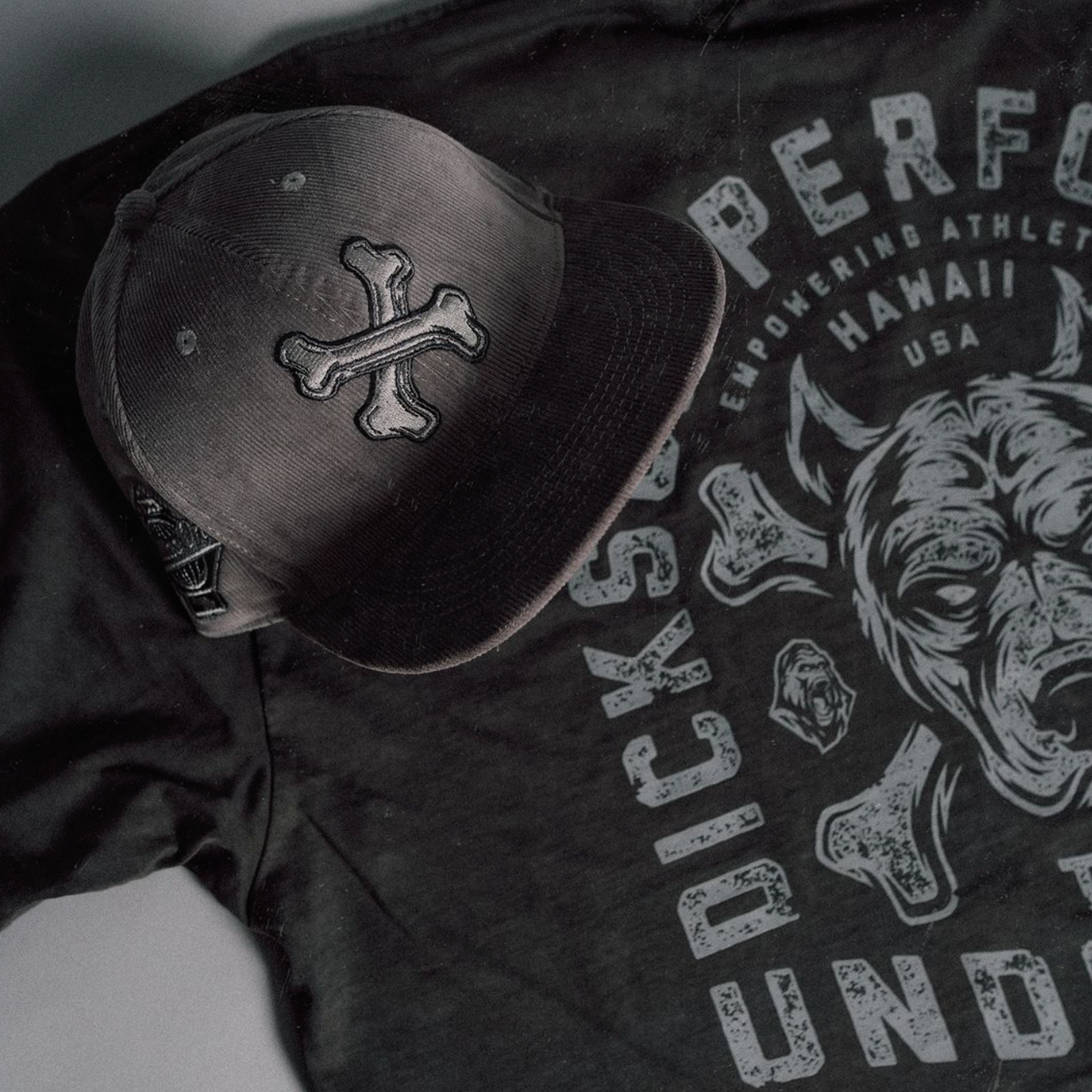
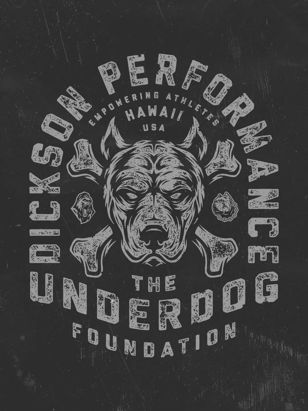
The apparel graphics mix several different type approaches depending on the tone of the design. Some graphics use bold athletic block lettering with heavy distressing to create intensity and movement. Others use gothic-inspired typography that pushes more into modern streetwear and lifestyle apparel aesthetics.
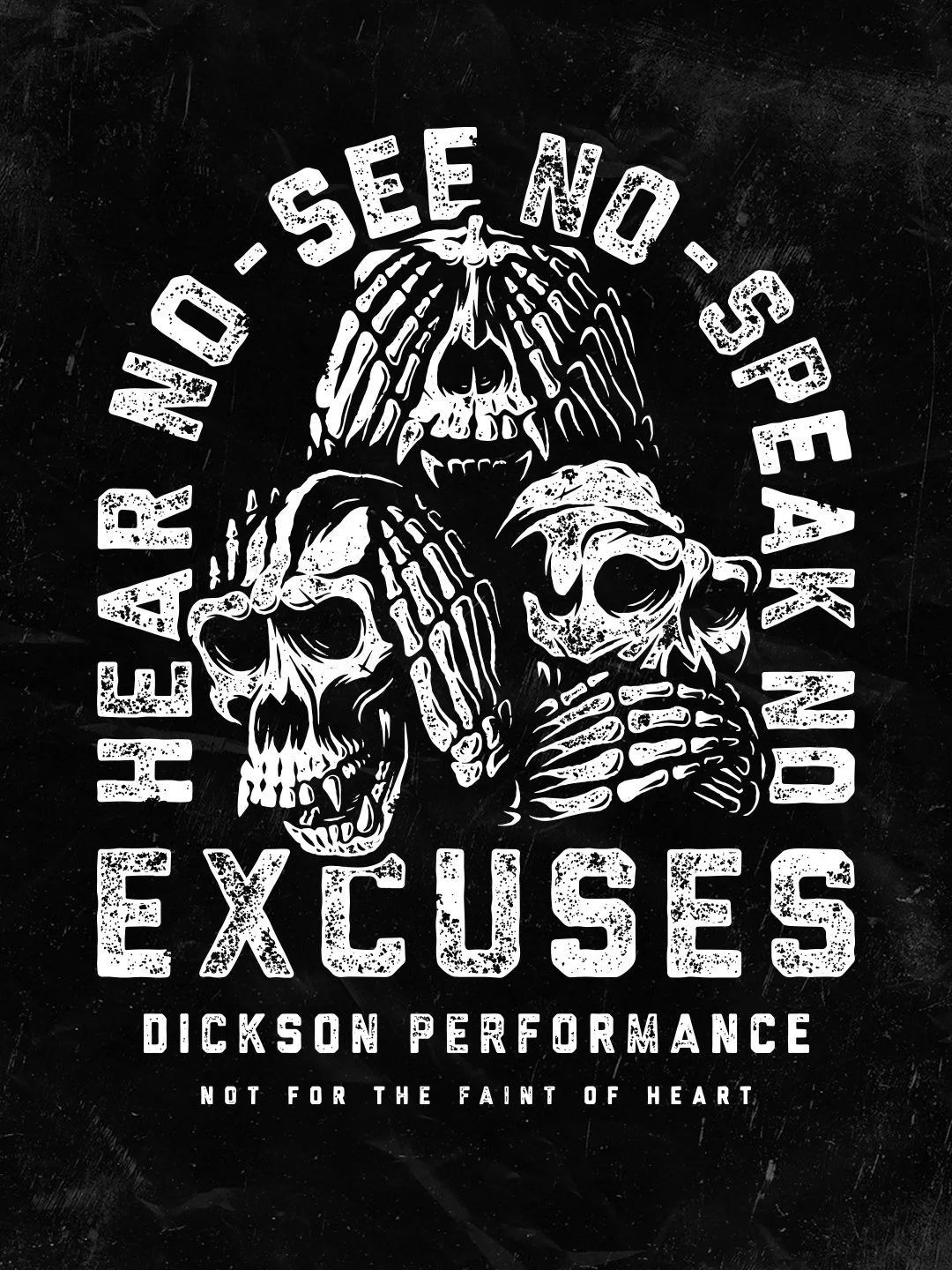
The “Hear No, See No, Speak No Evil” graphic is a good example of that heavier visual direction. The oversized distressed typography combined with skeletal illustration work creates an aggressive composition that immediately feels connected to hard training culture and athlete mentality.
The Underdog camp graphics shifted slightly differently.
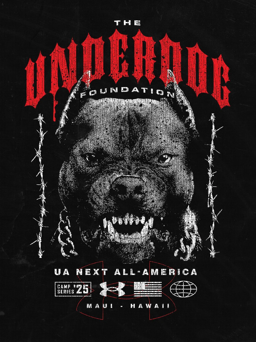
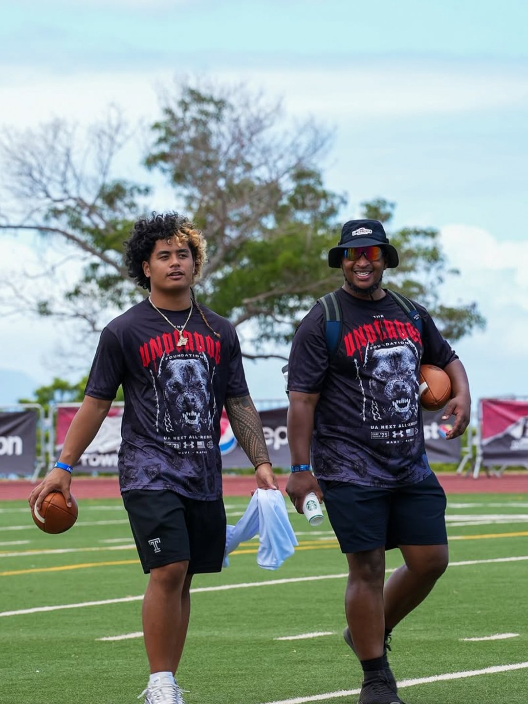
Those designs leaned into a more modern athletic streetwear direction using oversized gothic typography, limited color palettes, aggressive mascot illustration, and layered event branding details throughout the layout. The red, black, and white color system helped create strong visual contrast while keeping the apparel wearable.
A lot of attention also went into hierarchy and readability.
Athletic apparel gets viewed in motion, at events, on fields, in gyms, and across social content. The graphics needed to stay recognizable from a distance while still holding detail up close.
Distressing and texture were also used intentionally throughout many of the designs. Rather than applying texture randomly, it helped soften large graphic areas, add energy, and create a more worn-in athletic feel that matched the audience.
The mascot and illustration work became another important piece of the identity system. Dogs, skeletal references, aggressive expressions, and rugged iconography all tied back into resilience, toughness, discipline, and athlete mentality without feeling overly corporate or generic.
Deliverables
Across the ongoing relationship, deliverables have included:
custom t-shirt graphics
athletic apparel graphics
football camp shirt designs
event branding
embroidered hat graphics
logo design
social media graphics
athlete camp visuals
collaboration apparel graphics
tags and supporting apparel branding assets
The scope has continued evolving over time depending on camps, apparel launches, and ongoing brand needs.
Why This Project Worked
The visuals needed to feel authentic to athletes, youth programs, and the Hawaii community connected to the organizations. That changes the design decisions completely.
You start focusing less on making something look “designed” and more on making it feel believable within the environment it lives in.
The flexibility in style also helped a lot. Some projects needed heavier aggressive energy. Others needed a more lifestyle-oriented direction. Being able to move between those styles while keeping everything cohesive helped the apparel stay recognizable without becoming repetitive.
Seeing the apparel worn by athletes during camps and training events also reinforced what worked best visually. The strongest pieces typically combined:
bold silhouettes
readable typography
strong contrast
controlled detail
wearable layouts
authentic personality
The result was apparel that felt connected to the people wearing it instead of feeling disconnected from the culture surrounding the brand.
Related Questions:
What makes effective athletic apparel graphics?
Strong athletic apparel graphics prioritize readability, energy, wearability, and audience connection while still feeling authentic to the sport or training culture.
Why are streetwear influences becoming common in athletic branding?
Streetwear aesthetics help athletic apparel feel more wearable outside of training environments while creating stronger lifestyle appeal.
What should event camp apparel accomplish?
Good event apparel should create excitement around the event while still feeling wearable enough that athletes continue using it afterward.
Why does authenticity matter in sports apparel branding?
Athletes and sports communities can quickly recognize forced branding. Authentic visuals create stronger connection and long-term loyalty.
We love working with athletic brands, camps, and organizations that are deeply connected to their community and culture.
Whether it’s training apparel, event branding, youth athlete graphics, or ongoing apparel design support, the goal is always the same. To create visuals that feel authentic to the people wearing them.
If you’re building an athletic brand, sports program, gym, or event and want apparel graphics or logos that genuinely connect with your audience, we’d love to connect.