Packaging Design for the Omega Skinner Hunting Knife
When MTN Bonded approached us about packaging for their Omega Skinner knife, the goal wasn't simply to make a box look cool.
The product itself was already premium. The packaging needed to communicate that before a customer ever picked it up.
This project focused on creating custom hunting knife packaging that felt rugged, modern, and high quality while remaining highly functional for retail environments. Along with the packaging design, we developed custom typography, original illustration work, and creative direction to create a cohesive product presentation from every angle.
The end result was a packaging system designed specifically for hunters while also functioning as an effective retail sales tool.
The Brand Direction
Hunters are constantly surrounded by products competing for attention.
Walk through any hunting retailer and you'll see walls of products fighting for shelf space. When everything is trying to be aggressive and loud, it becomes even more important to be intentional.
For the Omega Skinner, we wanted the packaging to feel premium first and aggressive second.
The visual direction centered around three primary elements:
Bold custom typography
Hand-drawn elk skull illustration
Subtle topographic textures
The typography creates immediate recognition and readability from a distance. The elk skull illustration reinforces the hunting audience. The topographic pattern adds depth and texture while connecting back to western landscapes, public land hunting, and outdoor adventures.
Together, those elements create packaging that feels authentic to hunters without becoming visually cluttered.
Packaging Design Is More Than Graphics
One of the biggest misconceptions about packaging design is that it's simply graphic design placed onto a box.
In reality, packaging requires understanding how the product will be manufactured, assembled, displayed, handled, and experienced.
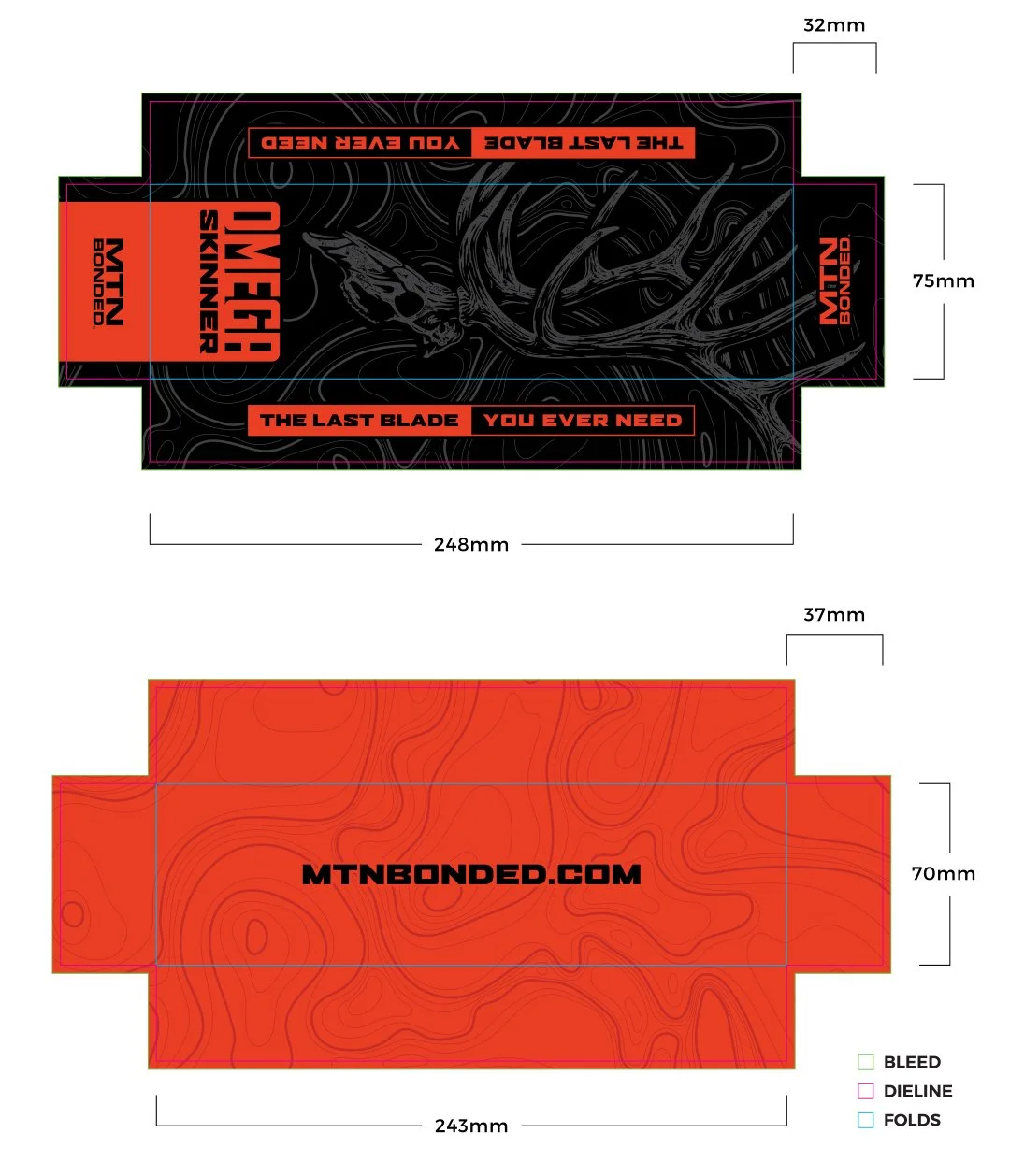
The dieline becomes just as important as the artwork itself.
Every panel has a purpose.
Every fold matters.
Every piece of information needs to appear in the right location once the package is physically assembled.
A design can look great on a flat layout and completely fail once it's folded.
For this project, careful attention was given to:
Panel orientation
Reading direction
Visual hierarchy
Fold locations
Product presentation
Retail visibility
Production setup
The goal was to ensure the packaging looked intentional from every angle, whether sitting on a shelf, standing upright, or being opened by a customer.
Design Details
The strongest packaging systems balance visual impact with clarity.
The Omega Skinner packaging uses a simple but effective hierarchy.
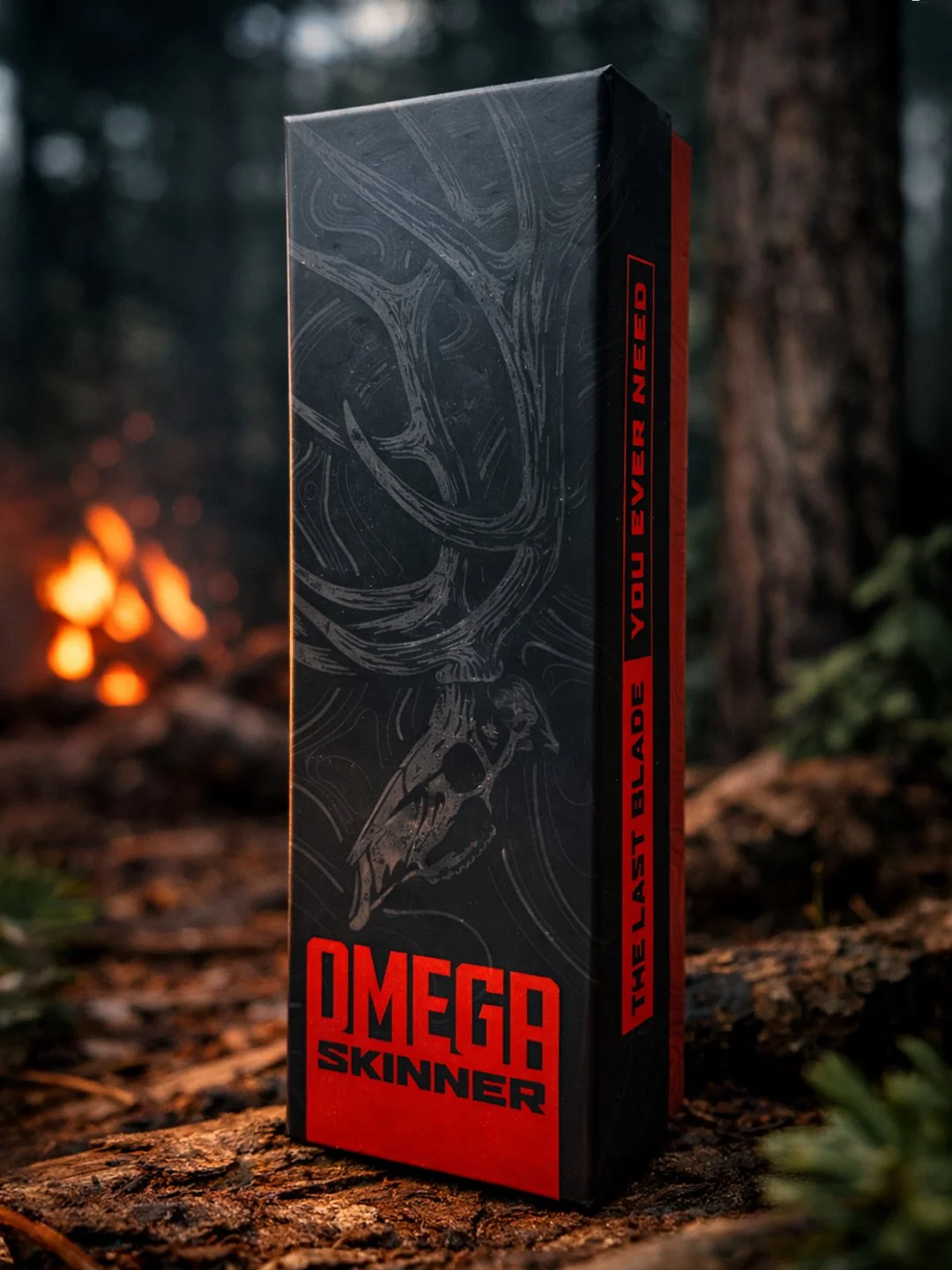
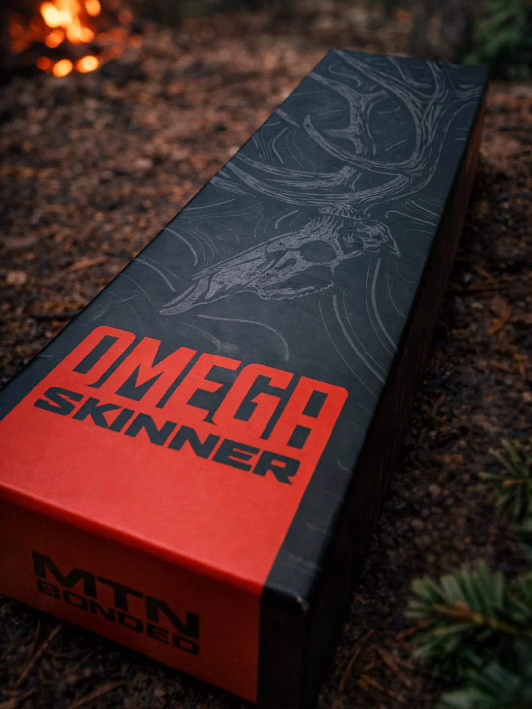
The product name is large, bold, and impossible to miss.
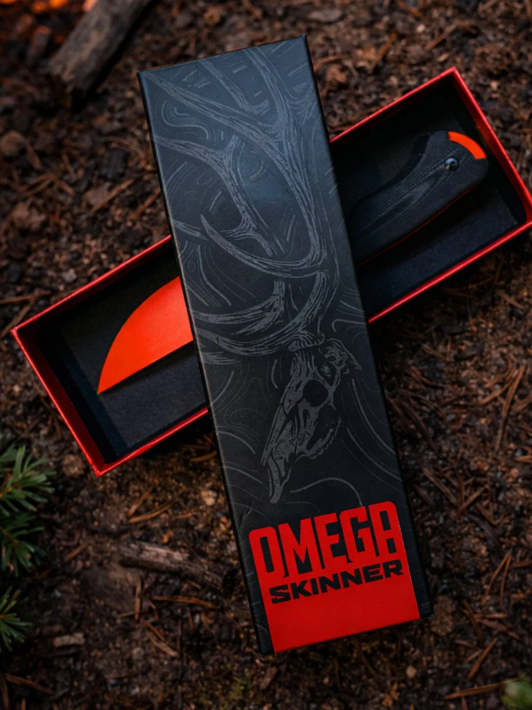
The red-orange accent color immediately draws attention while creating strong contrast against the dark background.
Rather than filling every inch with graphics, the illustration is allowed to breathe.
The oversized elk antlers stretch through the package and help guide the eye vertically across the design. The skull illustration creates a focal point while reinforcing the hunting market naturally.
The topographic texture works as a supporting layer rather than the main attraction. It's subtle enough to add depth but quiet enough to keep the typography dominant.
One detail that often gets overlooked in packaging design is how the artwork wraps around corners and transitions between panels.
We intentionally designed the illustration and texture system to flow naturally across the package structure so it feels like a complete object rather than individual disconnected panels.
That level of consideration is often what separates premium packaging from average packaging.
Deliverables
This project included:
Custom packaging design
Packaging layout and dieline application
Custom hand-drawn illustration
Custom typography
Creative direction
Production-ready packaging files
Why This Project Worked
This packaging succeeds because it does more than look good.
It performs.
The product name is easy to identify.
The illustration immediately connects with hunters.
The color contrast creates strong shelf visibility.
The package feels premium before it's ever opened.
Most importantly, every design decision supports the customer experience and the sales process.
Good packaging should help sell the product.
Great packaging should reinforce the value of the product.
For the Omega Skinner, the packaging helps communicate quality, durability, and confidence before the customer ever sees the blade itself.
Related Questions:
What makes hunting product packaging effective?
The best hunting packaging balances shelf visibility, readability, and authenticity. It should immediately connect with hunters while clearly communicating the product.
Why is packaging design different from graphic design?
Packaging design requires expertise around dielines, folds, production requirements, panel orientation, manufacturing constraints, and retail presentation in addition to visual design.
What should be considered before designing packaging?
Product dimensions, manufacturing method, material selection, shelf display, customer experience, panel hierarchy, and production requirements should all be considered before design begins.
Who designs packaging for hunting brands?
Dristy Design specializes in packaging design for hunting brands and other industries.
Looking for custom packaging design? If you're developing a hunting product, outdoor brand, or retail product and need packaging that does more than just look good, we'd love to help.
We specialize in creating packaging systems that combine strong visual design with real-world functionality, helping products stand out on shelves while staying production-ready from day one.