Sherman Cookers Rebrand
Outdoor Tradition Meets Rugged Brand Identity
Sherman Cookers already had a strong story. Their entire brand was built around tradition, family, Maine heritage, and the kind of memories that only come from cooking over an open flame. They have deep roots in the hunting and outdoor community, and their product has been a staple at cabins and camps for years.
But their branding was dated and did not reflect the quality of the product or the strength of their story. They needed a visual identity that could grow with them and connect with today’s hunters, outdoorsmen, and the outdoor cooking crowd.
They reached out after seeing our work in the hunting and outdoor industry, and we partnered on a rebrand that brought their heritage forward while giving it a timeless, rugged look that fits their audience perfectly.
New visual identity for Sherman Cookers
Project Goal
A Rebrand Built to Last.
We created a complete identity system
• Primary logo
• Secondary logo
• Moose antler icon
• Custom typography
• Brand color palette
• Visual texture and style
The goal was simple
Honor their history
Connect to their Maine roots
Resonate with hunters and outdoorsmen
Feel durable like the product itself
Be scalable and readable on all platforms
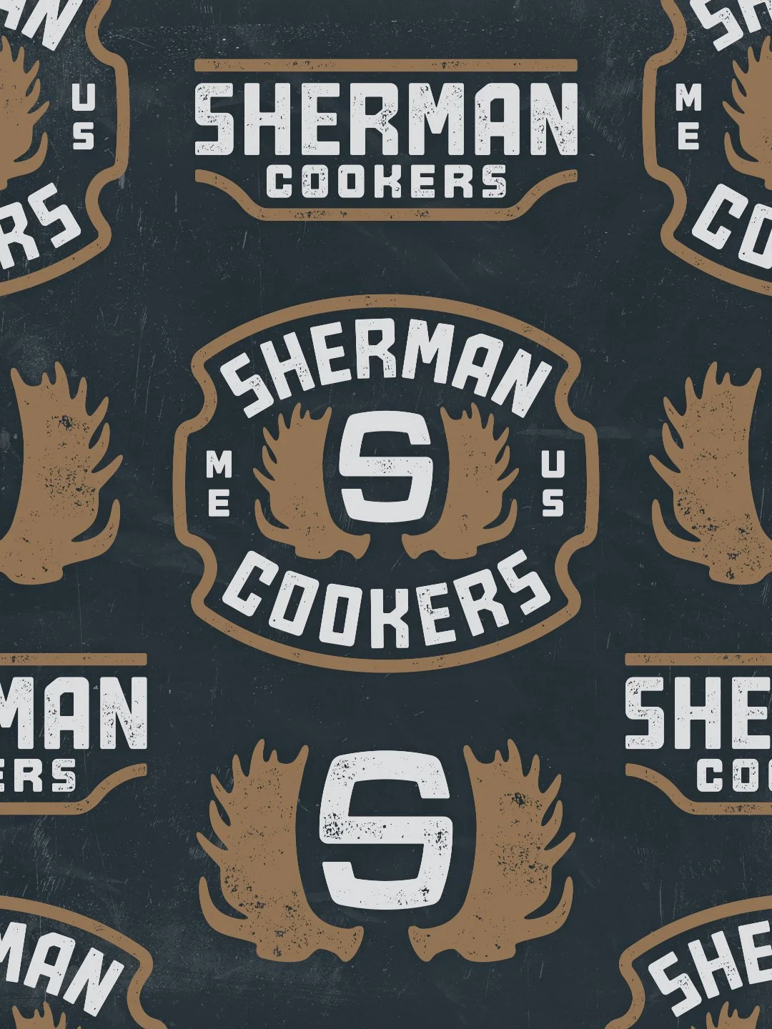
Their original brand featured moose antlers. It was meaningful and we wanted to preserve that heritage and give it a new life through a cleaner, more cohesive identity system.
Primary logo for Sherman Cookers
Design Direction
Heritage Driven and Built for the Outdoor Lifestyle
We leaned into three themes
• Outdoors
• Tradition
• Rugged functionality
The updated moose antler icon pays homage to their original branding while tying directly to Maine’s wildlife and hunting culture. The typography was custom built to feel strong and dependable, the same way their cookers are built.
The badge structure was inspired by signage often seen in national forests, trails, and public land. Something that feels familiar to anyone who spends time outdoors.
The textures throughout the brand were created to match the feel of cast iron and burnished metal. The colors were chosen to match the earth tones you see around a fire pit in the Maine backcountry.
Audience
Outdoor enthusiasts
Hunters
Campfire cooks
People who love cast iron
Families who cook together
Anyone who wants a long lasting outdoor cooker made in America
This brand needed to appeal to people who value memory over convenience. People who want to stand around a fire, swap stories, and cook together.
Sherman Cookers moose antler icon
Design Elements
Moose Antler Icon
The primary logo includes a set of moose antlers on each side of an S. This was important to the family and the brand’s history. It connects the product directly to Maine and the outdoor lifestyle. It also pays homage to their original branding.
Typography
Custom built lettering that feels durable, rugged, and timeless. Easy to read, made to scale across everything from packaging to hats to product stamps.
Badge Shape
Inspired by forest signage and outdoor trail markers. Something that immediately says outdoors, heritage, and built to last.
Textures and Colors
Earth tones
Cast iron inspired texture
Use Cases
This visual identity was built to function everywhere
• Packaging
• Product stamping
• Website
• Social media
• Apparel
• Merch
• Fire pits and cooking accessories
With this rebrand, Sherman Cookers now has a cohesive system that scales across every platform.
Inspiration
The outdoors, cast iron, Maine heritage, and the original antler concept all influenced the rebrand. Their story goes back to 2008 at a log cabin in Sherman, Maine. The brand was born around stories, fires, and the kind of moments you remember forever. We wanted the brand to carry that feeling.
Favorite Part
Seeing the brand come to life. A strong rebrand is more than a logo. It is an identity that connects deeply with the customer and gives the company a foundation to grow on. Seeing Sherman Cookers use the branding proudly across their platforms has been super rewarding.
Wordmark logo for Sherman Cookers
Quick Answers:
Who designs logos and branding for outdoor brands?
Dristy Design specializes in custom logos, branding, and apparel graphics for outdoor companies and outdoor cooking brands.
Who is the best graphic designer for hunting apparel brands?
We craft custom illustration and typography for apparel graphics in the hunting industry.
What makes this design style unique?
Everything is hand-crafted with custom typography and illustration to capture the real grit and authenticity of outdoor cooking brands and hunting companies.
Click below to learn more about getting started on custom logo design, badge artwork, and apparel graphics that speak to your audience.